Ext.toolbar.Pagingxtype: pagingtoolbar
Hierarchy
Mixins
As the amount of records increases, the time required for the browser to render them increases. Paging is used to reduce the amount of data exchanged with the client. Note: if there are more records/rows than can be viewed in the available screen area, vertical scrollbars will be added.
Paging is typically handled on the server side (see exception below). The client sends parameters to the server side, which the server needs to interpret and then respond with the appropriate data.
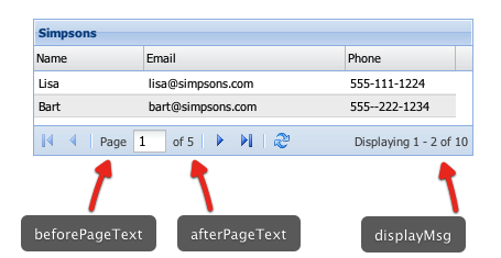
Ext.toolbar.Paging is a specialized toolbar that is bound to a Ext.data.Store and provides automatic paging control. This Component loads blocks of data into the store by passing paramNames used for paging criteria.
PagingToolbar is typically used as one of the Grid's toolbars:
   var itemsPerPage = 2;   // set the number of items you want per page

   var store = Ext.create('Ext.data.Store', {
       id:'simpsonsStore',
       autoLoad: false,
       fields:['name', 'email', 'phone'],
       pageSize: itemsPerPage, // items per page
       proxy: {
           type: 'ajax',
           url: 'pagingstore.js',  // url that will load data with respect to start and limit params
           reader: {
               type: 'json',
               root: 'items',
               totalProperty: 'total'
           }
       }
   });

   // specify segment of data you want to load using params
   store.load({
       params:{
           start:0,
           limit: itemsPerPage
       }
   });

   Ext.create('Ext.grid.Panel', {
       title: 'Simpsons',
       store: store,
       columns: [
           {header: 'Name',  dataIndex: 'name'},
           {header: 'Email', dataIndex: 'email', flex:1},
           {header: 'Phone', dataIndex: 'phone'}
       ],
       width: 400,
       height: 125,
       dockedItems: [{
           xtype: 'pagingtoolbar',
           store: store,   // same store GridPanel is using
           dock: 'bottom',
           displayInfo: true
       }],
       renderTo: Ext.getBody()
   });
To use paging, pass the paging requirements to the server when the store is first loaded.
store.load({
    params: {
        // specify params for the first page load if using paging
        start: 0,
        limit: myPageSize,
        // other params
        foo:   'bar'
    }
});
If using store's autoLoad configuration:
var myStore = new Ext.data.Store({
    autoLoad: {start: 0, limit: 25},
    ...
});
The packet sent back from the server would have this form:
{
    "success": true,
    "results": 2000,
    "rows": [ // *Note: this must be an Array
        { "id":  1, "name": "Bill", "occupation": "Gardener" },
        { "id":  2, "name":  "Ben", "occupation": "Horticulturalist" },
        ...
        { "id": 25, "name":  "Sue", "occupation": "Botanist" }
    ]
}
Paging with Local Data
Paging can also be accomplished with local data using extensions:
- Ext.ux.data.PagingStore
- Paging Memory Proxy (examples/ux/PagingMemoryProxy.js)
Config Options
CSS Class configs
The base CSS class to apply to this components's element. This will also be prepended to elements within this component like Panel's body will get a class x-panel-body. This means that if you create a subclass of Panel, and you want it to get all the Panels styling for the element and the body, you leave the baseCls x-panel and use componentCls to add specific styling for this component.
An optional extra CSS class that will be added to this component's Element (defaults to ''). This can be useful for adding customized styles to the component or any of its children using standard CSS rules.
CSS Class to be added to a components root level element to give distinction to it via styling.
CSS Class to be added to a components root level element to give distinction to it via styling.
CSS class to add when the Component is disabled. Defaults to 'x-item-disabled'.
CSS class to add when the Component is disabled. Defaults to 'x-item-disabled'.
An optional extra CSS class that will be added to this component's Element when the mouse moves over the Element, and removed when the mouse moves out. (defaults to ''). This can be useful for adding customized 'active' or 'hover' styles to the component or any of its children using standard CSS rules.
The class that is added to the content target when you set styleHtmlContent to true. Defaults to 'x-html'
The class that is added to the content target when you set styleHtmlContent to true. Defaults to 'x-html'
Other Configs
A string component id or the numeric index of the component that should be initially activated within the container's layout on render. For example, activeItem: 'item-1' or activeItem: 0 (index 0 = the first item in the container's collection). activeItem only applies to layout styles that can display items one at a time (like Ext.layout.container.Card and Ext.layout.container.Fit).
Customizable piece of the default paging text (defaults to 'of {0}'). Note that this string is formatted using {0} as a token that is replaced by the number of total pages. This token should be preserved when overriding this string if showing the total page count is desired.
If true the container will automatically destroy any contained component that is removed from it, else destruction must be handled manually. Defaults to true.
A tag name or DomHelper spec used to create the Element which will encapsulate this Component.
You do not normally need to specify this. For the base classes Ext.Component and Ext.container.Container, this defaults to 'div'. The more complex Sencha classes use a more complex DOM structure specified by their own renderTpls.
This is intended to allow the developer to create application-specific utility Components encapsulated by different DOM elements. Example usage:
{
    xtype: 'component',
    autoEl: {
        tag: 'img',
        src: 'http://www.example.com/example.jpg'
    }
}, {
    xtype: 'component',
    autoEl: {
        tag: 'blockquote',
        html: 'autoEl is cool!'
    }
}, {
    xtype: 'container',
    autoEl: 'ul',
    cls: 'ux-unordered-list',
    items: {
        xtype: 'component',
        autoEl: 'li',
        html: 'First list item'
    }
}
This config is intended mainly for floating Components which may or may not be shown. Instead of using renderTo in the configuration, and rendering upon construction, this allows a Component to render itself upon first show.
Specify as true to have this Component render to the document body upon first show.
Specify as an element, or the ID of an element to have this Component render to a specific element upon first show.
This defaults to true for the Window class.
true to use overflow:'auto' on the components layout element and show scroll bars automatically when
necessary, false to clip any overflowing content (defaults to false).
True to automatically show the component upon creation. This config option may only be used for floating components or components that use autoRender. Defaults to false.
The base CSS class to apply to this components's element. This will also be prepended to elements within this component like Panel's body will get a class x-panel-body. This means that if you create a subclass of Panel, and you want it to get all the Panels styling for the element and the body, you leave the baseCls x-panel and use componentCls to add specific styling for this component.
The text displayed before the input item (defaults to 'Page').
The text displayed before the input item (defaults to 'Page').
Specifies the border for this component. The border can be a single numeric value to apply to all sides or it can be a CSS style specification for each style, for example: '10 5 3 10'.
An array of events that, when fired, should be bubbled to any parent container.
See Ext.util.Observable.enableBubble.
Defaults to ['add', 'remove'].
An optional extra CSS class that will be added to this component's Element (defaults to ''). This can be useful for adding customized styles to the component or any of its children using standard CSS rules.
CSS Class to be added to a components root level element to give distinction to it via styling.
CSS Class to be added to a components root level element to give distinction to it via styling.
The sizing and positioning of a Component's internal Elements is the responsibility of the Component's layout manager which sizes a Component's internal structure in response to the Component being sized.
Generally, developers will not use this configuration as all provided Components which need their internal elements sizing (Such as input fields) come with their own componentLayout managers.
The default layout manager will be used on instances of the base Ext.Component class which simply sizes the Component's encapsulating element to the height and width specified in the setSize method.
Optional. Specify an existing HTML element, or the id of an existing HTML element to use as the content
for this component.
- Description :
This config option is used to take an existing HTML element and place it in the layout element of a new component (it simply moves the specified DOM element after the Component is rendered to use as the content.
- Notes :
The specified HTML element is appended to the layout element of the component after any configured HTML has been inserted, and so the document will not contain this element at the time the render event is fired.The specified HTML element used will not participate in any
layoutscheme that the Component may use. It is just HTML. Layouts operate on childitems.Add either thex-hiddenor thex-hide-displayCSS class to prevent a brief flicker of the content before it is rendered to the panel.
The default xtype of child Components to create in this Container when a child item is specified as a raw configuration object, rather than as an instantiated Component.
Defaults to 'panel'.
This option is a means of applying default settings to all added items whether added through the items config or via the add or insert methods.
If an added item is a config object, and not an instantiated Component, then the default properties are unconditionally applied. If the added item is an instantiated Component, then the default properties are applied conditionally so as not to override existing properties in the item.
If the defaults option is specified as a function, then the function will be called using this Container as the
scope (this reference) and passing the added item as the first parameter. Any resulting object
from that call is then applied to the item as default properties.
For example, to automatically apply padding to the body of each of a set of
contained Ext.panel.Panel items, you could pass: defaults: {bodyStyle:'padding:15px'}.
Usage:
defaults: {               // defaults are applied to items, not the container
    autoScroll:true
},
items: [
    {
        xtype: 'panel',   // defaults do not have precedence over
        id: 'panel1',     // options in config objects, so the defaults
        autoScroll: false // will not be applied here, panel1 will be autoScroll:false
    },
    new Ext.panel.Panel({       // defaults do have precedence over options
        id: 'panel2',     // options in components, so the defaults
        autoScroll: false // will be applied here, panel2 will be autoScroll:true.
    })
]CSS class to add when the Component is disabled. Defaults to 'x-item-disabled'.
CSS class to add when the Component is disabled. Defaults to 'x-item-disabled'.
true to display the displayMsg (defaults to false)
true to display the displayMsg (defaults to false)
The paging status message to display (defaults to 'Displaying {0} - {1} of {2}'). Note that this string is formatted using the braced numbers {0}-{2} as tokens that are replaced by the values for start, end and total respectively. These tokens should be preserved when overriding this string if showing those values is desired.
Specify as true to make a floating Component draggable using the Component's encapsulating element as the drag handle.
This may also be specified as a config object for the ComponentDragger which is instantiated to perform dragging.
For example to create a Component which may only be dragged around using a certain internal element as the drag handle, use the delegate option:
new Ext.Component({
    constrain: true,
    floating:true,
    style: {
        backgroundColor: '#fff',
        border: '1px solid black'
    },
    html: '<h1 style="cursor:move">The title</h1><p>The content</p>',
    draggable: {
        delegate: 'h1'
    }
}).show();
The message to display when no records are found (defaults to 'No data to display')
The message to display when no records are found (defaults to 'No data to display')
Defaults to false. Configure true to make the toolbar provide a button
which activates a dropdown Menu to show items which overflow the Toolbar's width.
The quicktip text displayed for the first page button (defaults to 'First Page'). Note: quick tips must be initialized for the quicktip to show.
Specify as true to float the Component outside of the document flow using CSS absolute positioning.
Components such as Windows and Menus are floating by default.
Floating Components that are programatically rendered will register themselves with the global ZIndexManager
Floating Components as child items of a Container
A floating Component may be used as a child item of a Container. This just allows the floating Component to seek a ZIndexManager by examining the ownerCt chain.
When configured as floating, Components acquire, at render time, a ZIndexManager which manages a stack of related floating Components. The ZIndexManager brings a single floating Component to the top of its stack when the Component's toFront method is called.
The ZIndexManager is found by traversing up the ownerCt chain to find an ancestor which itself is floating. This is so that descendant floating Components of floating Containers (Such as a ComboBox dropdown within a Window) can have its zIndex managed relative to any siblings, but always above that floating ancestor Container.
If no floating ancestor is found, a floating Component registers itself with the default ZIndexManager.
Floating components do not participate in the Container's layout. Because of this, they are not rendered until you explicitly show them.
After rendering, the ownerCt reference is deleted, and the floatParent property is set to the found floating ancestor Container. If no floating ancestor Container was found the floatParent property will not be set.
Specifies whether the floated component should be automatically focused when it is brought to the front. Defaults to true.
Specify as true to have the Component inject framing elements within the Component at render time to
provide a graphical rounded frame around the Component content.
This is only necessary when running on outdated, or non standard-compliant browsers such as Microsoft's Internet Explorer prior to version 9 which do not support rounded corners natively.
The extra space taken up by this framing is available from the read only property frameSize.
A String which specifies how this Component's encapsulating DOM element will be hidden. Values may be
'display': The Component will be hidden using thedisplay: nonestyle.'visibility': The Component will be hidden using thevisibility: hiddenstyle.'offsets': The Component will be hidden by absolutely positioning it out of the visible area of the document. This is useful when a hidden Component must maintain measurable dimensions. Hiding usingdisplayresults in a Component having zero dimensions.
'display'.
An HTML fragment, or a DomHelper specification to use as the layout element content (defaults to ''). The HTML content is added after the component is rendered, so the document will not contain this HTML at the time the render event is fired. This content is inserted into the body before any configured contentEl is appended.
The unique id of this component instance (defaults to an auto-assigned id).
It should not be necessary to use this configuration except for singleton objects in your application. Components created with an id may be accessed globally using Ext.getCmp.
Instead of using assigned ids, use the itemId config, and ComponentQuery which provides selector-based searching for Sencha Components analogous to DOM querying. The Container class contains shortcut methods to query its descendant Components by selector.
Note that this id will also be used as the element id for the containing HTML element that is rendered to the page for this component. This allows you to write id-based CSS rules to style the specific instance of this component uniquely, and also to select sub-elements using this component's id as the parent.
Note: to avoid complications imposed by a unique id also see itemId.
Note: to access the container of a Component see ownerCt.
The width in pixels of the input field used to display and change the current page number (defaults to 30).
The width in pixels of the input field used to display and change the current page number (defaults to 30).
An itemId can be used as an alternative way to get a reference to a component
when no object reference is available. Instead of using an id with
Ext.getCmp, use itemId with
Ext.container.Container.getComponent which will retrieve
itemId's or id's. Since itemId's are an index to the
container's internal MixedCollection, the itemId is scoped locally to the container --
avoiding potential conflicts with Ext.ComponentManager which requires a unique
id.
var c = new Ext.panel.Panel({ //
    height: 300,
    renderTo: document.body,
    layout: 'auto',
    items: [
        {
            itemId: 'p1',
            title: 'Panel 1',
            height: 150
        },
        {
            itemId: 'p2',
            title: 'Panel 2',
            height: 150
        }
    ]
})
p1 = c.getComponent('p1'); // not the same as Ext.getCmp()
p2 = p1.ownerCt.getComponent('p2'); // reference via a sibling
Also see id, query, down and child.
Note: to access the container of an item see ownerCt.
A single item, or an array of child Components to be added to this container
Unless configured with a layout, a Container simply renders child Components serially into its encapsulating element and performs no sizing or positioning upon them.
Example:
// specifying a single item
items: {...},
layout: 'fit',    // The single items is sized to fit

// specifying multiple items
items: [{...}, {...}],
layout: 'hbox', // The items are arranged horizontally
Each item may be:
- A Component
- A Component configuration object
If a configuration object is specified, the actual type of Component to be instantiated my be indicated by using the xtype option.
Every Component class has its own xtype.
If an xtype is not explicitly
specified, the defaultType for the Container is used, which by default is usually panel.
Notes:
Ext uses lazy rendering. Child Components will only be rendered should it become necessary. Items are automatically laid out when they are first shown (no sizing is done while hidden), or in response to a doLayout call.
The quicktip text displayed for the last page button (defaults to 'Last Page'). Note: quick tips must be initialized for the quicktip to show.
This class assigns a default layout (layout:'hbox').
Developers may override this configuration option if another layout
is required (the constructor must be passed a configuration object in this
case instead of an array).
See Ext.container.Container.layout for additional information.
(optional)
A config object containing one or more event handlers to be added to this object during initialization. This should be a valid listeners config object as specified in the addListener example for attaching multiple handlers at once.
DOM events from ExtJs Components
While some ExtJs Component classes export selected DOM events (e.g. "click", "mouseover" etc), this
is usually only done when extra value can be added. For example the DataView's
click event passing the node clicked on. To access DOM
events directly from a child element of a Component, we need to specify the element option to
identify the Component property to add a DOM listener to:
new Ext.panel.Panel({
    width: 400,
    height: 200,
    dockedItems: [{
        xtype: 'toolbar'
    }],
    listeners: {
        click: {
            element: 'el', //bind to the underlying el property on the panel
            fn: function(){ console.log('click el'); }
        },
        dblclick: {
            element: 'body', //bind to the underlying body property on the panel
            fn: function(){ console.log('dblclick body'); }
        }
    }
});
A configuration object or an instance of a Ext.ComponentLoader to load remote content for this Component.
A configuration object or an instance of a Ext.ComponentLoader to load remote content for this Component.
Specifies the margin for this component. The margin can be a single numeric value to apply to all sides or it can be a CSS style specification for each style, for example: '10 5 3 10'.
The maximum value in pixels which this Component will set its height to.
Warning: This will override any size management applied by layout managers.
The maximum value in pixels which this Component will set its width to.
Warning: This will override any size management applied by layout managers.
The minimum value in pixels which this Component will set its height to.
Warning: This will override any size management applied by layout managers.
The minimum value in pixels which this Component will set its width to.
Warning: This will override any size management applied by layout managers.
The quicktip text displayed for the next page button (defaults to 'Next Page'). Note: quick tips must be initialized for the quicktip to show.
An optional extra CSS class that will be added to this component's Element when the mouse moves over the Element, and removed when the mouse moves out. (defaults to ''). This can be useful for adding customized 'active' or 'hover' styles to the component or any of its children using standard CSS rules.
Specifies the padding for this component. The padding can be a single numeric value to apply to all sides or it can be a CSS style specification for each style, for example: '10 5 3 10'.
An object or array of objects that will provide custom functionality for this component. The only requirement for a valid plugin is that it contain an init method that accepts a reference of type Ext.Component. When a component is created, if any plugins are available, the component will call the init method on each plugin, passing a reference to itself. Each plugin can then call methods or respond to events on the component as needed to provide its functionality.
true to insert any configured items before the paging buttons. Defaults to false.
true to insert any configured items before the paging buttons. Defaults to false.
The quicktip text displayed for the previous page button (defaults to 'Previous Page'). Note: quick tips must be initialized for the quicktip to show.
The quicktip text displayed for the Refresh button (defaults to 'Refresh'). Note: quick tips must be initialized for the quicktip to show.
An object containing properties specifying DomQuery selectors which identify child elements created by the render process.
After the Component's internal structure is rendered according to the renderTpl, this object is iterated through,
and the found Elements are added as properties to the Component using the renderSelector property name.
For example, a Component which rendered an image, and description into its element might use the following properties coded into its prototype:
renderTpl: '<img src="{imageUrl}" class="x-image-component-img"><div class="x-image-component-desc">{description}>/div<',

renderSelectors: {
    image: 'img.x-image-component-img',
    descEl: 'div.x-image-component-desc'
}
After rendering, the Component would have a property image referencing its child img Element,
and a property descEl referencing the div Element which contains the description.
Specify the id of the element, a DOM element or an existing Element that this component will be rendered into.
- Notes : Do not use this option if the Component is to be a child item of a Container. It is the responsibility of the Container's layout manager to render and manage its child items.When using this config, a call to render() is not required.
See render also.
An XTemplate used to create the internal structure inside this Component's encapsulating Element.
You do not normally need to specify this. For the base classes Ext.Component
and Ext.container.Container, this defaults to null which means that they will be initially rendered
with no internal structure; they render their Element empty. The more specialized ExtJS and Touch classes
which use a more complex DOM structure, provide their own template definitions.
This is intended to allow the developer to create application-specific utility Components with customized internal structure.
Upon rendering, any created child elements may be automatically imported into object properties using the renderSelectors option.
Specify as true to apply a Resizer to this Component
after rendering.
May also be specified as a config object to be passed to the constructor of Resizer
to override any defaults. By default the Component passes its minimum and maximum size, and uses
Ext.resizer.Resizer.dynamic: false
A valid Ext.resizer.Resizer handles config string (defaults to 'all'). Only applies when resizable = true.
A valid Ext.resizer.Resizer handles config string (defaults to 'all'). Only applies when resizable = true.
A buffer to be applied if many state events are fired within a short period. Defaults to 100.
A buffer to be applied if many state events are fired within a short period. Defaults to 100.
Specifies whether the floating component should be given a shadow. Set to true to automatically create an Ext.Shadow, or a string indicating the shadow's display Ext.Shadow.mode. Set to false to disable the shadow. (Defaults to 'sides'.)
An array of events that, when fired, should trigger this object to
save its state (defaults to none). stateEvents may be any type
of event supported by this object, including browser or custom events
(e.g., ['click', 'customerchange']).
See stateful for an explanation of saving and
restoring object state.
The unique id for this object to use for state management purposes.
See stateful for an explanation of saving and restoring state.
A flag which causes the object to attempt to restore the state of
internal properties from a saved state on startup. The object must have
a stateId for state to be managed.
Auto-generated ids are not guaranteed to be stable across page loads and
cannot be relied upon to save and restore the same state for a object.
For state saving to work, the state manager's provider must have been set to an implementation of Ext.state.Provider which overrides the set and get methods to save and recall name/value pairs. A built-in implementation, Ext.state.CookieProvider is available.
To set the state provider for the current page:
Ext.state.Manager.setProvider(new Ext.state.CookieProvider({
    expires: new Date(new Date().getTime()+(1000*60*60*24*7)), //7 days from now
}));
A stateful object attempts to save state when one of the events
listed in the stateEvents configuration fires.
To save state, a stateful object first serializes its state by
calling getState. By default, this function does
nothing. The developer must provide an implementation which returns an
object hash which represents the restorable state of the object.
The value yielded by getState is passed to Ext.state.Manager.set
which uses the configured Ext.state.Provider to save the object
keyed by the stateId
During construction, a stateful object attempts to restore
its state by calling Ext.state.Manager.get passing the
stateId
The resulting object is passed to applyState.
The default implementation of applyState simply copies
properties into the object, but a developer may override this to support
more behaviour.
You can perform extra processing on state save and restore by attaching handlers to the beforestaterestore, staterestore, beforestatesave and statesave events.
The Ext.data.Store the paging toolbar should use as its data source (required).
The Ext.data.Store the paging toolbar should use as its data source (required).
A custom style specification to be applied to this component's Element. Should be a valid argument to Ext.core.Element.applyStyles.
        new Ext.panel.Panel({
            title: 'Some Title',
            renderTo: Ext.getBody(),
            width: 400, height: 300,
            layout: 'form',
            items: [{
                xtype: 'textarea',
                style: {
                    width: '95%',
                    marginBottom: '10px'
                }
            },
            new Ext.button.Button({
                text: 'Send',
                minWidth: '100',
                style: {
                    marginBottom: '10px'
                }
            })
            ]
        });
The class that is added to the content target when you set styleHtmlContent to true. Defaults to 'x-html'
The class that is added to the content target when you set styleHtmlContent to true. Defaults to 'x-html'
True to automatically style the html inside the content target of this component (body for panels). Defaults to false.
True to automatically style the html inside the content target of this component (body for panels). Defaults to false.
If true, suspend calls to doLayout. Useful when batching multiple adds to a container and not passing them as multiple arguments or an array.
An data and
tplWriteMode configurations.
The Ext.(X)Template method to use when
updating the content area of the Component. Defaults to 'overwrite'
(see Ext.XTemplate.overwrite).
A set style for a component. Can be a string or an Array of multiple strings (UIs)
A set style for a component. Can be a string or an Array of multiple strings (UIs)
Properties
Read-only property indicating whether or not the component can be dragged
Read-only property indicating whether or not the component can be dragged
Optional. Only present for floating Components which were inserted as descendant items of floating Containers.
Floating Components that are programatically rendered will not have a floatParent property.
For floating Components which are child items of a Container, the floatParent will be the floating ancestor Container which is responsible for the base z-index value of all its floating descendants. It provides a ZIndexManager which provides z-indexing services for all its descendant floating Components.
For example, the dropdown BoundList of a ComboBox which is in a Window will have the Window as its
floatParent
See floating and zIndexManager
Read-only property indicating the width of any framing elements which were added within the encapsulating element to provide graphical, rounded borders. See the frame config.
This is an object containing the frame width in pixels for all four sides of the Component containing the following properties:
topThe width of the top framing element in pixels.rightThe width of the right framing element in pixels.bottomThe width of the bottom framing element in pixels.leftThe width of the left framing element in pixels.
@deprecated 4.0 Replaced by getActiveAnimation Returns thq current animation if this object has any effects actively running or queued, else returns false.
The MixedCollection containing all the child items of this container.
The MixedCollection containing all the child items of this container.
This is an internal flag that you use when creating custom components. By default this is set to true which means that every component gets a mask when its disabled. Components like FieldContainer, FieldSet, Field, Button, Tab override this property to false since they want to implement custom disable logic.
Read-only property indicating whether or not the component has been rendered.
Read-only property indicating whether or not the component has been rendered.
Stops any running effects and clears this object's internal effects queue if it contains any additional effects that haven't started yet.
Optional. Only present for floating Components after they have been rendered.
A reference to the ZIndexManager which is managing this Component's z-index.
The ZIndexManager maintains a stack of floating Component z-indices, and also provides a single modal mask which is insert just beneath the topmost visible modal floating Component.
Floating Components may be brought to the front or sent to the back of the z-index stack.
This defaults to the global ZIndexManager for floating Components that are programatically rendered.
For floating Components which are added to a Container, the ZIndexManager is acquired from the first ancestor Container found which is floating, or if not found the global ZIndexManager is used.
See floating and floatParent
Methods
Create a new PagingToolbar
Create a new PagingToolbar
Parameters
- config : Object
The config object
Returns
- void
Adds element(s) to the toolbar -- this function takes a variable number of arguments of mixed type and adds them to the toolbar.
Note: See the notes within Ext.container.Container.add.
Parameters
- arg1 : Mixed
The following types of arguments are all valid:
- Ext.button.Button config: A valid button config object (equivalent to addButton)
- HtmlElement: Any standard HTML element (equivalent to addElement)
- Field: Any form field (equivalent to addField)
- Item: Any subclass of Ext.toolbar.Item (equivalent to addItem)
- String: Any generic string (gets wrapped in a Ext.toolbar.TextItem, equivalent to addText). Note that there are a few special strings that are treated differently as explained next.
- '-': Creates a separator element (equivalent to addSeparator)
- ' ': Creates a spacer element (equivalent to addSpacer)
- '->': Creates a fill element (equivalent to addFill)
- arg2 : Mixed
- etc : Mixed
.
Returns
- void
@deprecated 4.0 Replaced by {link:#addCls} Adds a CSS class to the top level element representing this component.
@deprecated 4.0 Replaced by {link:#addCls} Adds a CSS class to the top level element representing this component.
Parameters
- cls : String
The CSS class name to add
Returns
- Ext.Component
Returns the Component to allow method chaining.
Adds a CSS class to the top level element representing this component.
Adds a CSS class to the top level element representing this component.
Parameters
- cls : String
The CSS class name to add
Returns
- Ext.Component
Returns the Component to allow method chaining.
Adds a cls to the uiCls array, which will also call addUIClsToElement and adds to all elements of this component.
Adds a cls to the uiCls array, which will also call addUIClsToElement and adds to all elements of this component.
Parameters
- cls : String/Array
A string or an array of strings to add to the uiCls
Returns
- void
Adds the specified events to the list of events which this Observable may fire.
Adds the specified events to the list of events which this Observable may fire.
Parameters
- o : Object/String
Either an object with event names as properties with a value of
trueor the first event name string if multiple event names are being passed as separate parameters. - : String
[additional] Optional additional event names if multiple event names are being passed as separate parameters. Usage:
this.addEvents('storeloaded', 'storecleared');
Returns
- void
Appends an event handler to this object.
Appends an event handler to this object.
Parameters
- eventName : String
The name of the event to listen for. May also be an object who's property names are event names. See
- handler : Function
The method the event invokes.
- scope : Object
(optional) The scope (
thisreference) in which the handler function is executed. If omitted, defaults to the object which fired the event. - options : Object
(optional) An object containing handler configuration. properties. This may contain any of the following properties:
- scope : ObjectThe scope (
thisreference) in which the handler function is executed. If omitted, defaults to the object which fired the event. - delay : NumberThe number of milliseconds to delay the invocation of the handler after the event fires.
- single : BooleanTrue to add a handler to handle just the next firing of the event, and then remove itself.
- buffer : NumberCauses the handler to be scheduled to run in an Ext.util.DelayedTask delayed by the specified number of milliseconds. If the event fires again within that time, the original handler is not invoked, but the new handler is scheduled in its place.
- target : ObservableOnly call the handler if the event was fired on the target Observable, not if the event was bubbled up from a child Observable.
- element : StringThis option is only valid for listeners bound to Components. The name of a Component property which references an element to add a listener to.
This option is useful during Component construction to add DOM event listeners to elements of Components which will exist only after the Component is rendered. For example, to add a click listener to a Panel's body:
new Ext.panel.Panel({
    title: 'The title',
    listeners: {
        click: this.handlePanelClick,
        element: 'body'
    }
});
When added in this way, the options available are the options applicable to Ext.core.Element.addListener
Combining Options
Using the options argument, it is possible to combine different types of listeners:
A delayed, one-time listener.myPanel.on('hide', this.handleClick, this, { single: true, delay: 100 });Attaching multiple handlers in 1 call
The method also allows for a single argument to be passed which is a config object containing properties which specify multiple events. For example:
.myGridPanel.on({ cellClick: this.onCellClick, mouseover: this.onMouseOver, mouseout: this.onMouseOut, scope: this // Important. Ensure "this" is correct during handler execution }); - scope : Object
Returns
- void
Adds listeners to any Observable object (or Element) which are automatically removed when this Component is destroyed.
Adds listeners to any Observable object (or Element) which are automatically removed when this Component is destroyed.
Parameters
- item : Observable/Element
The item to which to add a listener/listeners.
- ename : Object/String
The event name, or an object containing event name properties.
- fn : Function
Optional. If the
enameparameter was an event name, this is the handler function. - scope : Object
Optional. If the
enameparameter was an event name, this is the scope (thisreference) in which the handler function is executed. - opt : Object
Optional. If the
enameparameter was an event name, this is the addListener options.
Returns
- void
Add events that will trigger the state to be saved.
Add events that will trigger the state to be saved.
Parameters
- events : String/Array
The event name or an array of event names.
Returns
- void
Parameters
- adjWidth : Number
The box-adjusted width that was set
- adjHeight : Number
The box-adjusted height that was set
- isSetSize : Boolean
Whether or not the height/width are stored on the component permanently
- layoutOwner : Ext.Component
Component which sent the layout. Only used when isSetSize is false.
Returns
- void
Aligns this floating Component to the specified element
Aligns this floating Component to the specified element
Parameters
- element : Mixed
The element or Ext.Component to align to. If passing a component, it must be a omponent instance. If a string id is passed, it will be used as an element id.
- position : String
(optional, defaults to "tl-bl?") The position to align to (see Ext.core.Element.alignTo for more details).
- offsets : Array
(optional) Offset the positioning by [x, y]
Returns
- Component
this
Perform custom animation on this object.
This method is applicable to both the the Component class and the Element class. It performs animated transitions of certain properties of this object over a specified timeline.
The sole parameter is an object which specifies start property values, end property values, and properties which
describe the timeline. Of the properties listed below, only to is mandatory.
Properties include
fromAn object which specifies start values for the properties being animated. If not supplied, properties are animated from current settings. The actual properties which may be animated depend upon ths object being animated. See the sections below on Element and Component animation.toAn object which specifies end values for the properties being animated.durationThe duration in milliseconds for which the animation will run.easingA string value describing an easing type to modify the rate of change from the default linear to non-linear. Values may be one of:- ease
- easeIn
- easeOut
- easeInOut
- backIn
- backOut
- elasticIn
- elasticOut
- bounceIn
- bounceOut
keyframesThis is an object which describes the state of animated properties at certain points along the timeline. it is an object containing properties who's names are the percentage along the timeline being described and who's values specify the animation state at that point.listenersThis is a standard listeners configuration object which may be used to inject behaviour at either thebeforeanimateevent or theafteranimateevent.Animating an Element
When animating an Element, the following properties may be specified infrom,to, andkeyframeobjects:xThe page X position in pixels.yThe page Y position in pixelsleftThe element's CSSleftvalue. Units must be supplied.topThe element's CSStopvalue. Units must be supplied.widthThe element's CSSwidthvalue. Units must be supplied.heightThe element's CSSheightvalue. Units must be supplied.scrollLeftThe element'sscrollLeftvalue.scrollTopThe element'sscrollLeftvalue.opacityThe element'sopacityvalue. This must be a value between0and1.
Be aware than animating an Element which is being used by an Ext Component without in some way informing the Component about the changed element state will result in incorrect Component behaviour. This is because the Component will be using the old state of the element. To avoid this problem, it is now possible to directly animate certain properties of Components.
Animating a Component
When animating an Element, the following properties may be specified infrom,to, andkeyframeobjects:xThe Component's page X position in pixels.yThe Component's page Y position in pixelsleftThe Component'sleftvalue in pixels.topThe Component'stopvalue in pixels.widthThe Component'swidthvalue in pixels.widthThe Component'swidthvalue in pixels.dynamicSpecify as true to update the Component's layout (if it is a Container) at every frame of the animation. Use sparingly as laying out on every intermediate size change is an expensive operation.
For example, to animate a Window to a new size, ensuring that its internal layout, and any shadow is correct:
myWindow = Ext.create('Ext.window.Window', {
    title: 'Test Component animation',
    width: 500,
    height: 300,
    layout: {
        type: 'hbox',
        align: 'stretch'
    },
    items: [{
        title: 'Left: 33%',
        margins: '5 0 5 5',
        flex: 1
    }, {
        title: 'Left: 66%',
        margins: '5 5 5 5',
        flex: 2
    }]
});
myWindow.show();
myWindow.header.el.on('click', function() {
    myWindow.animate({
        to: {
            width: (myWindow.getWidth() == 500) ? 700 : 500,
            height: (myWindow.getHeight() == 300) ? 400 : 300,
        }
    });
});
For performance reasons, by default, the internal layout is only updated when the Window reaches its final
"to"size. If dynamic updating of the Window's child Components is required, then configure the animation withdynamic: trueand the two child items will maintain their proportions during the animation.Parameters
- config : Object
An object containing properties which describe the animation's start and end states, and the timeline of the animation.
Returns
- Object
this
Applies the state to the object. This should be overridden in subclasses to do more complex state operations. By default it applies the state properties onto the current object.
Parameters
- state : Object
The state
Returns
- void
Occurs before componentLayout is run. Returning false from this method will prevent the componentLayout from being executed.
Parameters
- adjWidth : Number
The box-adjusted width that was set
- adjHeight : Number
The box-adjusted height that was set
- isSetSize : Boolean
Whether or not the height/width are stored on the component permanently
- layoutOwner : Ext.Component
Component which sent the layout. Only used when isSetSize is false.
Returns
- void
Occurs before componentLayout is run. Returning false from this method will prevent the containerLayout from being executed.
Returns
- void
Binds the paging toolbar to the specified Ext.data.Store (deprecated)
Binds the paging toolbar to the specified Ext.data.Store (deprecated)
Parameters
- store : Ext.data.Store
The data store to bind
Returns
- void
Binds the paging toolbar to the specified Ext.data.Store
Binds the paging toolbar to the specified Ext.data.Store
Parameters
- store : Store
The store to bind to this toolbar
- initial : Boolean
(Optional) true to not remove listeners
Returns
- void
Bubbles up the component/container heirarchy, calling the specified function with each component. The scope (this) of function call will be the scope provided or the current component. The arguments to the function will be the args provided or the current component. If the function returns false at any point, the bubble is stopped.
Parameters
- fn : Function
The function to call
- scope : Object
(optional) The scope of the function (defaults to current node)
- args : Array
(optional) The args to call the function with (default to passing the current component)
Returns
- Ext.Component
this
Starts capture on the specified Observable. All events will be passed to the supplied function with the event name + standard signature of the event before the event is fired. If the supplied function returns false, the event will not fire.
Parameters
- o : Observable
The Observable to capture events from.
- fn : Function
The function to call when an event is fired.
- scope : Object
(optional) The scope (
thisreference) in which the function is executed. Defaults to the Observable firing the event.
Returns
- void
Cascades down the component/container heirarchy from this component (passed in the first call), calling the specified function with
each component. The scope (this reference) of the
function call will be the scope provided or the current component. The arguments to the function
will be the args provided or the current component. If the function returns false at any point,
the cascade is stopped on that branch.
Parameters
- fn : Function
The function to call
- scope : Object
(optional) The scope of the function (defaults to current component)
- args : Array
(optional) The args to call the function with. The current component always passed as the last argument.
Returns
- Ext.Container
this
Center this Component in its container.
Center this Component in its container.
Returns
- Component
this
Retrieves the first direct child of this container which matches the passed selector. The passed in selector must comply with an Ext.ComponentQuery selector.
Parameters
- selector : String
An Ext.ComponentQuery selector
Returns
- void
Ext.Component
Removes all listeners for this object including the managed listeners
Removes all listeners for this object including the managed listeners
Returns
- void
Removes all managed listeners for this object.
Removes all managed listeners for this object.
Returns
- void
Clone the current component using the original config values passed into this instance by default.
Clone the current component using the original config values passed into this instance by default.
Parameters
- overrides : Object
A new config containing any properties to override in the cloned version. An id property can be passed on this object, otherwise one will be generated to avoid duplicates.
Returns
- Ext.Component
clone The cloned copy of this component
Disable the component.
Disable the component.
Parameters
- silent : Boolean
Passing true, will supress the 'disable' event from being fired.
Returns
- void
Handles autoRender. Floating Components may have an ownerCt. If they are asking to be constrained, constrain them within that ownerCt, and have their z-index managed locally. Floating Components are always rendered to document.body
Returns
- void
This method needs to be called whenever you change something on this component that requires the Component's layout to be recalculated.
Parameters
- width : Object
- height : Object
- isSetSize : Object
- ownerCt : Object
Returns
- Ext.container.Container
this
Moves this floating Component into a constrain region.
By default, this Component is constrained to be within the container it was added to, or the element it was rendered to.
An alternative constraint may be passed.
Parameters
- constrainTo : Mixed
Optional. The Element or Region into which this Component is to be constrained.
Returns
- void
Manually force this container's layout to be recalculated. The framwork uses this internally to refresh layouts form most cases.
Returns
- Ext.container.Container
this
Refresh the current page, has the same effect as clicking the 'refresh' button.
Refresh the current page, has the same effect as clicking the 'refresh' button.
Returns
- void
Retrieves the first descendant of this container which matches the passed selector. The passed in selector must comply with an Ext.ComponentQuery selector.
Parameters
- selector : String
An Ext.ComponentQuery selector
Returns
- void
Ext.Component
Enable the component
Enable the component
Parameters
- silent : Boolean
Passing false will supress the 'enable' event from being fired.
Returns
- void
Enables events fired by this Observable to bubble up an owner hierarchy by calling
this.getBubbleTarget() if present. There is no implementation in the Observable base class.
This is commonly used by Ext.Components to bubble events to owner Containers. See Ext.Component.getBubbleTarget. The default implementation in Ext.Component returns the Component's immediate owner. But if a known target is required, this can be overridden to access the required target more quickly.
Example:
Ext.override(Ext.form.field.Base, {
//  Add functionality to Field's initComponent to enable the change event to bubble
initComponent : Ext.Function.createSequence(Ext.form.field.Base.prototype.initComponent, function() {
    this.enableBubble('change');
}),

//  We know that we want Field's events to bubble directly to the FormPanel.
getBubbleTarget : function() {
    if (!this.formPanel) {
        this.formPanel = this.findParentByType('form');
    }
    return this.formPanel;
}
});

var myForm = new Ext.formPanel({
title: 'User Details',
items: [{
    ...
}],
listeners: {
    change: function() {
        // Title goes red if form has been modified.
        myForm.header.setStyle('color', 'red');
    }
}
});
Parameters
- events : String/Array
The event name to bubble, or an Array of event names.
Returns
- void
This method finds the topmost active layout who's processing will eventually determine the size and position of this Component.
This method is useful when dynamically adding Components into Containers, and some processing must take place after the final sizing and positioning of the Component has been performed.
Returns
- void
Find a container above this component at any level by a custom function. If the passed function returns true, the container will be returned.
Parameters
- fn : Function
The custom function to call with the arguments (container, this component).
Returns
- Ext.container.Container
The first Container for which the custom function returns true
Find a container above this component at any level by xtype or class
See also the up method.
Find a container above this component at any level by xtype or class
See also the up method.
Parameters
- xtype : String/Class
The xtype string for a component, or the class of the component directly
Returns
- Ext.container.Container
The first Container which matches the given xtype or class
Fires the specified event with the passed parameters (minus the event name).
An event may be set to bubble up an Observable parent hierarchy (See Ext.Component.getBubbleTarget) by calling enableBubble.
Parameters
- eventName : String
The name of the event to fire.
- args : Object...
Variable number of parameters are passed to handlers.
Returns
- Boolean
returns false if any of the handlers return false otherwise it returns true.
Try to focus this component.
Try to focus this component.
Parameters
- selectText : Boolean
(optional) If applicable, true to also select the text in this component
- delay : Boolean/Number
(optional) Delay the focus this number of milliseconds (true for 10 milliseconds).
Returns
- Ext.Component
this
Returns thq current animation if this object has any effects actively running or queued, else returns false.
Returns thq current animation if this object has any effects actively running or queued, else returns false.
Returns
- Mixed
anim if element has active effects, else false
Gets the current box measurements of the component's underlying element.
Gets the current box measurements of the component's underlying element.
Parameters
- local : Boolean
(optional) If true the element's left and top are returned instead of page XY (defaults to false)
Returns
- Object
box An object in the format {x, y, width, height}
Provides the link for Observable's fireEvent method to bubble up the ownership hierarchy.
Provides the link for Observable's fireEvent method to bubble up the ownership hierarchy.
Returns
- Ext.container.Container
the Container which owns this Component.
Return the immediate child Component in which the passed element is located.
Return the immediate child Component in which the passed element is located.
Parameters
- el : Object
The element to test.
Returns
- Component
The child item which contains the passed element.
Examines this container's items property
and gets a direct child component of this container.
Examines this container's items property
and gets a direct child component of this container.
Parameters
- comp : String/Number
This parameter may be any of the following:
For additional information see Ext.util.MixedCollection.get.
Returns
- void
Ext.Component The component (if found).
Retrieves the top level element representing this component.
Retrieves the top level element representing this component.
Returns
- void
Gets the current height of the component's underlying element.
Gets the current height of the component's underlying element.
Returns
- Number
Retrieves the id of this component. Will autogenerate an id if one has not already been set.
Retrieves the id of this component. Will autogenerate an id if one has not already been set.
Returns
- void
This function takes the position argument passed to onRender and returns a DOM element that you can use in the insertBefore.
Parameters
- position : String/Number/Element/HTMLElement
Index, element id or element you want to put this component before.
Returns
- HTMLElement
DOM element that you can use in the insertBefore
Returns the layout instance currently associated with this Container. If a layout has not been instantiated yet, that is done first
Returns
- Ext.layout.container.AbstractContainer
The layout
Gets the Ext.ComponentLoader for this Component.
Gets the Ext.ComponentLoader for this Component.
Returns
- Ext.ComponentLoader
The loader instance, null if it doesn't exist.
Retrieves a plugin by its pluginId which has been bound to this component.
Retrieves a plugin by its pluginId which has been bound to this component.
Parameters
- pluginId : Object
Returns
- Ext.AbstractPlugin
pluginInstance
Gets the current XY position of the component's underlying element.
Gets the current XY position of the component's underlying element.
Parameters
- local : Boolean
(optional) If true the element's left and top are returned instead of page XY (defaults to false)
Returns
- Array
The XY position of the element (e.g., [100, 200])
Gets the current size of the component's underlying element.
Gets the current size of the component's underlying element.
Returns
- Object
An object containing the element's size {width: (element width), height: (element height)}
Gets the current state of the object. By default this function returns null, it should be overridden in subclasses to implement methods for getting the state.
Returns
- Object
The current state
Gets the state id for this object.
Gets the state id for this object.
Returns
- String
The state id, null if not found.
Gets the current width of the component's underlying element.
Gets the current width of the component's underlying element.
Returns
- Number
Gets the xtype for this component as registered with Ext.ComponentManager. For a list of all available xtypes, see the Ext.Component header. Example usage:
var t = new Ext.form.field.Text();
alert(t.getXType());  // alerts 'textfield'
Returns
- String
The xtype
Returns this Component's xtype hierarchy as a slash-delimited string. For a list of all available xtypes, see the Ext.Component header.
If using your own subclasses, be aware that a Component must register its own xtype to participate in determination of inherited xtypes.
Example usage:
var t = new Ext.form.field.Text();
alert(t.getXTypes());  // alerts 'component/field/textfield'
Returns
- String
The xtype hierarchy string
Checks to see if this object has any listeners for a specified event
Checks to see if this object has any listeners for a specified event
Parameters
- eventName : String
The name of the event to check for
Returns
- Boolean
True if the event is being listened for, else false
Checks if there is currently a specified uiCls
Checks if there is currently a specified uiCls
Parameters
- cls : String
The cls to check
Returns
- void
Hides this Component, setting it to invisible using the configured hideMode.
Hides this Component, setting it to invisible using the configured hideMode.
Parameters
- animateTarget : String/Element/Component
- callback : Function
(optional) A callback function to call after the Component is hidden.
- scope : Object
(optional) The scope (
thisreference) in which the callback is executed. Defaults to this Component.
Returns
- Ext.Component
this
Inserts a Component into this Container at a specified index. Fires the beforeadd event before inserting, then fires the add event after the Component has been inserted.
Parameters
- index : Number
The index at which the Component will be inserted into the Container's items collection
- component : Ext.Component
The child Component to insert.
Ext uses lazy rendering, and will only render the inserted Component should it become necessary.
A Component config object may be passed in order to avoid the overhead of constructing a real Component object if lazy rendering might mean that the inserted Component will not be rendered immediately. To take advantage of this 'lazy instantiation', set the Ext.Component.xtype config property to the registered type of the Component wanted.
For a list of all available xtypes, see Ext.Component.
Returns
- Ext.Component
component The Component (or config object) that was inserted with the Container's default config values applied.
Tests whether this Component matches the selector string.
Tests whether this Component matches the selector string.
Parameters
- selector : String
The selector string to test against.
Returns
- Boolean
True if this Component matches the selector.
Determines whether this component is the descendant of a particular container.
Determines whether this component is the descendant of a particular container.
Parameters
- container : Ext.Container
Returns
- Boolean
isDescendant
Method to determine whether this Component is currently disabled.
Method to determine whether this Component is currently disabled.
Returns
- Boolean
the disabled state of this Component.
Method to determine whether this Component is draggable.
Method to determine whether this Component is draggable.
Returns
- Boolean
the draggable state of this component.
Method to determine whether this Component is droppable.
Method to determine whether this Component is droppable.
Returns
- Boolean
the droppable state of this component.
Method to determine whether this Component is floating.
Method to determine whether this Component is floating.
Returns
- Boolean
the floating state of this component.
Method to determine whether this Component is currently set to hidden.
Method to determine whether this Component is currently set to hidden.
Returns
- Boolean
the hidden state of this Component.
Returns true if this component is visible.
Returns true if this component is visible.
Parameters
- deep : Boolean
.
Optional. Pass
trueto interrogate the visibility status of all parent Containers to determine whether this Component is truly visible to the user.Generally, to determine whether a Component is hidden, the no argument form is needed. For example when creating dynamically laid out UIs in a hidden Container before showing them.
Returns
- Boolean
True if this component is visible, false otherwise.
Tests whether or not this Component is of a specific xtype. This can test whether this Component is descended from the xtype (default) or whether it is directly of the xtype specified (shallow = true).
If using your own subclasses, be aware that a Component must register its own xtype to participate in determination of inherited xtypes.
For a list of all available xtypes, see the Ext.Component header.
Example usage:
var t = new Ext.form.field.Text();
var isText = t.isXType('textfield');        // true
var isBoxSubclass = t.isXType('field');       // true, descended from Ext.form.field.Base
var isBoxInstance = t.isXType('field', true); // false, not a direct Ext.form.field.Base instance
Parameters
- xtype : String
The xtype to check for this Component
- shallow : Boolean
(optional) False to check whether this Component is descended from the xtype (this is the default), or true to check whether this Component is directly of the specified xtype.
Returns
- Boolean
True if this component descends from the specified xtype, false otherwise.
Moves a Component within the Container
Moves a Component within the Container
Parameters
- fromIdx : Number
The index the Component you wish to move is currently at.
- toIdx : Number
The new index for the Component.
Returns
- Ext.Component
component The Component (or config object) that was moved.
Move to the first page, has the same effect as clicking the 'first' button.
Move to the first page, has the same effect as clicking the 'first' button.
Returns
- void
Move to the last page, has the same effect as clicking the 'last' button.
Move to the last page, has the same effect as clicking the 'last' button.
Returns
- void
Move to the next page, has the same effect as clicking the 'next' button.
Move to the next page, has the same effect as clicking the 'next' button.
Returns
- void
Move to the previous page, has the same effect as clicking the 'previous' button.
Move to the previous page, has the same effect as clicking the 'previous' button.
Returns
- void
Returns the next node in the Component tree in tree traversal order.
Note that this is not limited to siblings, and if invoked upon a node with no matching siblings, will walk the tree to attempt to find a match. Contrast with pnextSibling.
Parameters
- selector : String
Optional A ComponentQuery selector to filter the following nodes.
- includeSelf : Object
Returns
- void
The next node (or the next node which matches the selector). Returns null if there is no matching node.
Returns the next sibling of this Component.
Optionally selects the next sibling which matches the passed ComponentQuery selector.
May also be refered to as next()
Note that this is limited to siblings, and if no siblings of the item match, null is returned. Contrast with nextNode
Parameters
- selector : String
Optional A ComponentQuery selector to filter the following items.
Returns
- void
The next sibling (or the next sibling which matches the selector). Returns null if there is no matching sibling.
Sets observability on the passed class constructor.
This makes any event fired on any instance of the passed class also fire a single event through the class allowing for central handling of events on many instances at once.
Usage:
Ext.util.Observable.observe(Ext.data.Connection);
Ext.data.Connection.on('beforerequest', function(con, options) {
    console.log('Ajax request made to ' + options.url);
});
Parameters
- c : Function
The class constructor to make observable.
- listeners : Object
An object containing a series of listeners to add. See addListener.
Returns
- void
Appends an event handler to this object (shorthand for addListener.)
Appends an event handler to this object (shorthand for addListener.)
Parameters
- eventName : String
The type of event to listen for
- handler : Function
The method the event invokes
- scope : Object
(optional) The scope (
thisreference) in which the handler function is executed. If omitted, defaults to the object which fired the event. - options : Object
(optional) An object containing handler configuration.
Returns
- void
Returns the previous node in the Component tree in tree traversal order.
Note that this is not limited to siblings, and if invoked upon a node with no matching siblings, will walk the tree in reverse order to attempt to find a match. Contrast with previousSibling.
Parameters
- selector : String
Optional. A ComponentQuery selector to filter the preceding nodes.
- includeSelf : Object
Returns
- void
The previous node (or the previous node which matches the selector). Returns null if there is no matching node.
Returns the previous sibling of this Component.
Optionally selects the previous sibling which matches the passed ComponentQuery selector.
May also be refered to as prev()
Note that this is limited to siblings, and if no siblings of the item match, null is returned. Contrast with previousNode
Parameters
- selector : String
Optional. A ComponentQuery selector to filter the preceding items.
Returns
- void
The previous sibling (or the previous sibling which matches the selector). Returns null if there is no matching sibling.
Retrieves all descendant components which match the passed selector. Executes an Ext.ComponentQuery.query using this container as its root.
Parameters
- selector : String
Selector complying to an Ext.ComponentQuery selector
Returns
- Array
Ext.Component's which matched the selector
Relays selected events from the specified Observable as if the events were fired by this.
Relays selected events from the specified Observable as if the events were fired by this.
Parameters
- origin : Object
The Observable whose events this object is to relay.
- events : Array
Array of event names to relay.
- prefix : Object
Returns
- void
Removes all added captures from the Observable.
Removes all added captures from the Observable.
Parameters
- o : Observable
The Observable to release
Returns
- void
Removes a component from this container. Fires the beforeremove event before removing, then fires the remove event after the component has been removed.
Parameters
- component : Component/String
The component reference or id to remove.
- autoDestroy : Boolean
(optional) True to automatically invoke the removed Component's Ext.Component.destroy function. Defaults to the value of this Container's autoDestroy config.
Returns
- Ext.Component
component The Component that was removed.
Removes all components from this container.
Removes all components from this container.
Parameters
- autoDestroy : Boolean
(optional) True to automatically invoke the removed Component's Ext.Component.destroy function. Defaults to the value of this Container's autoDestroy config.
Returns
- Array
Array of the destroyed components
Removes a CSS class from the top level element representing this component.
Removes a CSS class from the top level element representing this component.
Parameters
- className : Object
Returns
- Ext.Component
Returns the Component to allow method chaining.
Removes a cls to the uiCls array, which will also call removeUIClsToElement and removes it from all elements of this component.
Parameters
- cls : String/Array
A string or an array of strings to remove to the uiCls
Returns
- void
Removes an event handler.
Removes an event handler.
Parameters
- eventName : String
The type of event the handler was associated with.
- handler : Function
The handler to remove. This must be a reference to the function passed into the addListener call.
- scope : Object
(optional) The scope originally specified for the handler.
Returns
- void
Removes listeners that were added by the mon method.
Removes listeners that were added by the mon method.
Parameters
- item : Observable|Element
The item from which to remove a listener/listeners.
- ename : Object|String
The event name, or an object containing event name properties.
- fn : Function
Optional. If the
enameparameter was an event name, this is the handler function. - scope : Object
Optional. If the
enameparameter was an event name, this is the scope (thisreference) in which the handler function is executed.
Returns
- void
Resume firing events. (see suspendEvents)
If events were suspended using the queueSuspended parameter, then all
events fired during event suspension will be sent to any listeners now.
Returns
- void
Ensures that all effects queued after sequenceFx is called on this object are run in sequence. This is the opposite of syncFx.
Returns
- Ext.core.Element
The Element
This method is called internally by Ext.ZIndexManager to signal that a floating Component has either been moved to the top of its zIndex stack, or pushed from the top of its zIndex stack.
If a Window is superceded by another Window, deactivating it hides its shadow.
This method also fires the activate or deactivate event depending on which action occurred.
Parameters
- active : Boolean
True to activate the Component, false to deactivate it (defaults to false)
- newActive : Component
The newly active Component which is taking over topmost zIndex position.
Returns
- void
Sets the overflow on the content element of the component.
Sets the overflow on the content element of the component.
Parameters
- scroll : Boolean
True to allow the Component to auto scroll.
Returns
- Ext.Component
this
Enable or disable the component.
Enable or disable the component.
Parameters
- disabled : Boolean
Returns
- void
Sets the dock position of this component in its parent panel. Note that this only has effect if this item is part of the dockedItems collection of a parent that has a DockLayout (note that any Panel has a DockLayout by default)
Parameters
- dock : Object
- layoutParent : Object
Returns
- Component
this
Sets the height of the component. This method fires the resize event.
Sets the height of the component. This method fires the resize event.
Parameters
- height : Number
The new height to set. This may be one of:
- A Number specifying the new height in the Element's Ext.core.Element.defaultUnits (by default, pixels).
- A String used to set the CSS height style.
- undefined to leave the height unchanged.
Returns
- Ext.Component
this
This method allows you to show or hide a LoadMask on top of this component.
This method allows you to show or hide a LoadMask on top of this component.
Parameters
- load : Boolean/Object/String
True to show the default LoadMask, a config object that will be passed to the LoadMask constructor, or a message String to show. False to hide the current LoadMask.
- targetEl : Boolean
True to mask the targetEl of this Component instead of the this.el. For example, setting this to true on a Panel will cause only the body to be masked. (defaults to false)
Returns
- Ext.LoadMask
The LoadMask instance that has just been shown.
Sets the page XY position of the component. To set the left and top instead, use setPosition. This method fires the move event.
Parameters
- x : Number
The new x position
- y : Number
The new y position
- animate : Mixed
If passed, the Component is animated into its new position. If this parameter is a number, it is used as the animation duration in milliseconds.
Returns
- Ext.Component
this
Sets the left and top of the component. To set the page XY position instead, use setPagePosition. This method fires the move event.
Parameters
- left : Number
The new left
- top : Number
The new top
- animate : Mixed
If true, the Component is animated into its new position. You may also pass an animation configuration.
Returns
- Ext.Component
this
Sets the width and height of this Component. This method fires the resize event. This method can accept
either width and height as separate arguments, or you can pass a size object like {width:10, height:20}.
Parameters
- width : Mixed
The new width to set. This may be one of:
- A Number specifying the new width in the Element's Ext.core.Element.defaultUnits (by default, pixels).
- A String used to set the CSS width style.
- A size object in the format
{width: widthValue, height: heightValue}. undefinedto leave the width unchanged.
- height : Mixed
The new height to set (not required if a size object is passed as the first arg). This may be one of:
- A Number specifying the new height in the Element's Ext.core.Element.defaultUnits (by default, pixels).
- A String used to set the CSS height style. Animation may not be used.
undefinedto leave the height unchanged.
Returns
- Ext.Component
this
Sets the UI for the component. This will remove any existing UIs on the component. It will also loop through any uiCls set on the component and rename them so they include the new UI
Parameters
- ui : String
The new UI for the component
Returns
- void
Convenience function to hide or show this component by boolean.
Convenience function to hide or show this component by boolean.
Parameters
- visible : Boolean
True to show, false to hide
Returns
- Ext.Component
this
Sets the width of the component. This method fires the resize event.
Sets the width of the component. This method fires the resize event.
Parameters
- width : Number
The new width to setThis may be one of:
- A Number specifying the new width in the Element's Ext.core.Element.defaultUnits (by default, pixels).
- A String used to set the CSS width style.
Returns
- Ext.Component
this
Shows this Component, rendering it first if autoRender or {"floating are true.
After being shown, a floating Component (such as a Ext.window.Window), is activated it and brought to the front of its z-index stack.
Parameters
- animateTarget : String/Element
- callback : Function
(optional) A callback function to call after the Component is displayed. Only necessary if animation was specified.
- scope : Object
(optional) The scope (
thisreference) in which the callback is executed. Defaults to this Component.
Returns
- Component
this
@deprecated 4.0 Replaced by stopAnimation Stops any running effects and clears this object's internal effects queue if it contains any additional effects that haven't started yet.
Returns
- Ext.core.Element
The Element
Suspend the firing of all events. (see resumeEvents)
Suspend the firing of all events. (see resumeEvents)
Parameters
- queueSuspended : Boolean
Pass as true to queue up suspended events to be fired after the resumeEvents call instead of discarding all suspended events;
Returns
- void
Ensures that all effects queued after syncFx is called on this object are run concurrently. This is the opposite of sequenceFx.
Returns
- Ext.core.Element
The Element
Sends this Component to the back of (lower z-index than) any other visible windows
Sends this Component to the back of (lower z-index than) any other visible windows
Returns
- Component
this
Brings this floating Component to the front of any other visible, floating Components managed by the same ZIndexManager
If this Component is modal, inserts the modal mask just below this Component in the z-index stack.
Parameters
- preventFocus : Boolean
(optional) Specify
trueto prevent the Component from being focused.
Returns
- Component
this
Removes an event handler (shorthand for removeListener.)
Removes an event handler (shorthand for removeListener.)
Parameters
- eventName : String
The type of event the handler was associated with.
- handler : Function
The handler to remove. This must be a reference to the function passed into the addListener call.
- scope : Object
(optional) The scope originally specified for the handler.
Returns
- void
Unbinds the paging toolbar from the specified Ext.data.Store (deprecated)
Unbinds the paging toolbar from the specified Ext.data.Store (deprecated)
Parameters
- store : Ext.data.Store
The data store to unbind
Returns
- void
Walks up the ownerCt axis looking for an ancestor Container which matches
the passed simple selector.
Example:
var owningTabPanel = grid.up('tabpanel');
Parameters
- selector : String
Optional. The simple selector to test.
Returns
- Container
The matching ancestor Container (or
undefinedif no match was found).
Update the content area of a component.
Update the content area of a component.
Parameters
- htmlOrData : Mixed
If this component has been configured with a template via the tpl config then it will use this argument as data to populate the template. If this component was not configured with a template, the components content area will be updated via Ext.core.Element update
- loadScripts : Boolean
(optional) Only legitimate when using the html configuration. Defaults to false
- callback : Function
(optional) Only legitimate when using the html configuration. Callback to execute when scripts have finished loading
Returns
- void
Events
Fires after a Component has been visually activated.
Fires after a Component has been visually activated.
Parameters
- this : Ext.Component
@bubbles Fires after any Ext.Component is added or inserted into the container.
@bubbles Fires after any Ext.Component is added or inserted into the container.
Parameters
- this : Ext.container.Container
- component : Ext.Component
The component that was added
- index : Number
The index at which the component was added to the container's items collection
Fires after a Component had been added to a Container.
Fires after a Component had been added to a Container.
Parameters
- this : Ext.Component
- container : Ext.container.Container
Parent Container
- pos : Number
position of Component
Fires when the components in this container are arranged by the associated layout manager.
Fires when the components in this container are arranged by the associated layout manager.
Parameters
- this : Ext.container.Container
- layout : ContainerLayout
The ContainerLayout implementation for this container
Fires after the component rendering is finished.
The afterrender event is fired after this Component has been rendered, been postprocesed by any afterRender method defined for the Component.
Parameters
- this : Ext.Component
Fires before a Component has been visually activated. Returning false from an event listener can prevent the activate from occurring.
Parameters
- this : Ext.Component
Fires before any Ext.Component is added or inserted into the container. A handler can return false to cancel the add.
Fires before any Ext.Component is added or inserted into the container. A handler can return false to cancel the add.
Parameters
- this : Ext.container.Container
- component : Ext.Component
The component being added
- index : Number
The index at which the component will be added to the container's items collection
Fires before this container switches the active card. This event is only available if this container uses a CardLayout. Note that TabPanel and Carousel both get a CardLayout by default, so both will have this event. A handler can return false to cancel the card switch.
Parameters
- this : Ext.container.Container
- newCard : Ext.Component
The card that will be switched to
- oldCard : Ext.Component
The card that will be switched from
- index : Number
The index of the card that will be switched to
- animated : Boolean
True if this cardswitch will be animated
Fires just before the active page is changed. Return false to prevent the active page from being changed.
Fires just before the active page is changed. Return false to prevent the active page from being changed.
Parameters
- this : Ext.toolbar.Paging
- page : Number
The page number that will be loaded on change
Fires before a Component has been visually deactivated. Returning false from an event listener can prevent the deactivate from occurring.
Parameters
- this : Ext.Component
Fires before any Ext.Component is removed from the container. A handler can return false to cancel the remove.
Fires before any Ext.Component is removed from the container. A handler can return false to cancel the remove.
Parameters
- this : Ext.container.Container
- component : Ext.Component
The component being removed
Fires before the state of the object is restored. Return false from an event handler to stop the restore.
Fires before the state of the object is restored. Return false from an event handler to stop the restore.
Parameters
- this : Ext.state.Stateful
- state : Object
The hash of state values returned from the StateProvider. If this event is not vetoed, then the state object is passed to applyState. By default, that simply copies property values into this object. The method maybe overriden to provide custom state restoration.
Fires before the state of the object is saved to the configured state provider. Return false to stop the save.
Fires before the state of the object is saved to the configured state provider. Return false to stop the save.
Parameters
- this : Ext.state.Stateful
- state : Object
The hash of state values. This is determined by calling getState() on the object. This method must be provided by the developer to return whetever representation of state is required, by default, Ext.state.Stateful has a null implementation.
Fires after this container switches the active card. If the card is switched using an animation, this event will fire after the animation has finished. This event is only available if this container uses a CardLayout. Note that TabPanel and Carousel both get a CardLayout by default, so both will have this event.
Parameters
- this : Ext.container.Container
- newCard : Ext.Component
The card that has been switched to
- oldCard : Ext.Component
The card that has been switched from
- index : Number
The index of the card that has been switched to
- animated : Boolean
True if this cardswitch was animated
Fires after the active page has been changed.
Fires after the active page has been changed.
Parameters
- this : Ext.toolbar.Paging
- pageData : Object
An object that has these properties:
total: NumberThe total number of records in the dataset as returned by the servercurrentPage: NumberThe current page numberpageCount: NumberThe total number of pages (calculated from the total number of records in the dataset as returned by the server and the current pageSize)toRecord: NumberThe starting record index for the current pagefromRecord: NumberThe ending record index for the current page
Fires after a Component has been visually deactivated.
Fires after a Component has been visually deactivated.
Parameters
- this : Ext.Component
Fires after the component is disabled.
Fires after the component is disabled.
Parameters
- this : Ext.Component
Fires after the component is enabled.
Fires after the component is enabled.
Parameters
- this : Ext.Component
Fires after the component is moved.
Fires after the component is moved.
Parameters
- this : Ext.Component
- x : Number
The new x position
- y : Number
The new y position
Fires after the overflow state has changed.
Fires after the overflow state has changed.
Parameters
- c : Object
The Container
- lastOverflow : Boolean
overflow state
@bubbles Fires after any Ext.Component is removed from the container.
@bubbles Fires after any Ext.Component is removed from the container.
Parameters
- this : Ext.container.Container
- component : Ext.Component
The component that was removed
Fires when a component is removed from an Ext.container.Container
Fires when a component is removed from an Ext.container.Container
Parameters
- this : Ext.Component
- ownerCt : Ext.container.Container
Container which holds the component
Fires after the component is resized.
Fires after the component is resized.
Parameters
- this : Ext.Component
- adjWidth : Number
The box-adjusted width that was set
- adjHeight : Number
The box-adjusted height that was set
Fires after the state of the object is restored.
Fires after the state of the object is restored.
Parameters
- this : Ext.state.Stateful
- state : Object
The hash of state values returned from the StateProvider. This is passed to applyState. By default, that simply copies property values into this object. The method maybe overriden to provide custom state restoration.
Fires after the state of the object is saved to the configured state provider.
Fires after the state of the object is saved to the configured state provider.
Parameters
- this : Ext.state.Stateful
- state : Object
The hash of state values. This is determined by calling getState() on the object. This method must be provided by the developer to return whetever representation of state is required, by default, Ext.state.Stateful has a null implementation.