Ext.form.field.Spinnerxtype: spinnerfield
Hierarchy
Ext.AbstractComponentExt.ComponentExt.form.field.BaseExt.form.field.TextExt.form.field.TriggerExt.form.field.SpinnerMixins
A field with a pair of up/down spinner buttons. This class is not normally instantiated directly, instead it is subclassed and the onSpinUp and onSpinDown methods are implemented to handle when the buttons are clicked. A good example of this is the Ext.form.field.Number field which uses the spinner to increment and decrement the field's value by its step config value.
 For example:
Ext.define('Ext.ux.CustomSpinner', {
extend: 'Ext.form.field.Spinner',
alias: 'widget.customspinner',
// override onSpinUp (using step isn't neccessary)
onSpinUp: function() {
var me = this;
if (!me.readOnly) {
var val = me.step; // set the default value to the step value
if(me.getValue() !== '') {
val = parseInt(me.getValue().slice(0, -5)); // gets rid of " Pack"
}
me.setValue((val + me.step) + ' Pack');
}
},
// override onSpinDown
onSpinDown: function() {
var me = this;
if (!me.readOnly) {
if(me.getValue() !== '') {
val = parseInt(me.getValue().slice(0, -5)); // gets rid of " Pack"
}
me.setValue((val - me.step) + ' Pack');
}
}
});
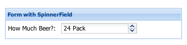
Ext.create('Ext.form.FormPanel', {
title: 'Form with SpinnerField',
bodyPadding: 5,
width: 350,
renderTo: Ext.getBody(),
items:[{
xtype: 'customspinner',
fieldLabel: 'How Much Beer?',
step: 6
}]
});
By default, pressing the up and down arrow keys will also trigger the onSpinUp and onSpinDown methods; to prevent this, set keyNavEnabled = false.
Config Options
CSS Class configs
The CSS class to be applied to the body content element. Defaults to 'x-form-item-body'.
The CSS class to be applied to the body content element. Defaults to 'x-form-item-body'.
The base CSS class to apply to this components's element. This will also be prepended to elements within this component like Panel's body will get a class x-panel-body. This means that if you create a subclass of Panel, and you want it to get all the Panels styling for the element and the body, you leave the baseCls x-panel and use componentCls to add specific styling for this component.
The CSS class to be applied to the special clearing div rendered directly after the field contents wrapper to provide field clearing (defaults to 'x-clear').
An optional extra CSS class that will be added to this component's Element (defaults to ''). This can be useful for adding customized styles to the component or any of its children using standard CSS rules.
CSS Class to be added to a components root level element to give distinction to it via styling.
CSS Class to be added to a components root level element to give distinction to it via styling.
CSS class to add when the Component is disabled. Defaults to 'x-item-disabled'.
CSS class to add when the Component is disabled. Defaults to 'x-item-disabled'.
The CSS class to apply to an empty field to style the emptyText (defaults to 'x-form-empty-field'). This class is automatically added and removed as needed depending on the current field value.
The CSS class to be applied to the error message element. Defaults to 'x-form-error-msg'.
The CSS class to be applied to the error message element. Defaults to 'x-form-error-msg'.
An extra CSS class to be applied to the body content element in addition to fieldBodyCls. Defaults to empty.
An extra CSS class to be applied to the body content element in addition to fieldBodyCls. Defaults to empty.
The default CSS class for the field input (defaults to 'x-form-field')
The default CSS class for the field input (defaults to 'x-form-field')
The CSS class to use when the field receives focus (defaults to 'x-form-focus')
The CSS class to use when the field receives focus (defaults to 'x-form-focus')
A CSS class to be applied to the outermost element to denote that it is participating in the form field layout. Defaults to 'x-form-item'.
The CSS class to use when marking the component invalid (defaults to 'x-form-invalid')
The CSS class to use when marking the component invalid (defaults to 'x-form-invalid')
The CSS class to be applied to the label element. Defaults to 'x-form-item-label'.
The CSS class to be applied to the label element. Defaults to 'x-form-item-label'.
An optional extra CSS class that will be added to this component's Element when the mouse moves over the Element, and removed when the mouse moves out. (defaults to ''). This can be useful for adding customized 'active' or 'hover' styles to the component or any of its children using standard CSS rules.
The class that is added to the content target when you set styleHtmlContent to true. Defaults to 'x-html'
The class that is added to the content target when you set styleHtmlContent to true. Defaults to 'x-html'
The base CSS class that is always added to the trigger button. The triggerCls will be appended in addition to this class.
An additional CSS class used to style the trigger button. The trigger will always get the triggerBaseCls by default and triggerCls will be appended if specified. Defaults to undefined.
The CSS class that is added to the div wrapping the trigger button(s).
The CSS class that is added to the div wrapping the trigger button(s).
Other Configs
If specified, then the component will be displayed with this value as its active error when first rendered. Defaults to undefined. Use setActiveError or unsetActiveError to change it after component creation.
The template used to format the Array of error messages passed to setActiveErrors into a single HTML string. By default this renders each message as an item in an unordered list.
Specify false to validate that the value's length is > 0 (defaults to true)
Specify false to validate that the value's length is > 0 (defaults to true)
A tag name or DomHelper spec used to create the Element which will encapsulate this Component.
You do not normally need to specify this. For the base classes Ext.Component and Ext.container.Container, this defaults to 'div'. The more complex Sencha classes use a more complex DOM structure specified by their own renderTpls.
This is intended to allow the developer to create application-specific utility Components encapsulated by different DOM elements. Example usage:
{
    xtype: 'component',
    autoEl: {
        tag: 'img',
        src: 'http://www.example.com/example.jpg'
    }
}, {
    xtype: 'component',
    autoEl: {
        tag: 'blockquote',
        html: 'autoEl is cool!'
    }
}, {
    xtype: 'container',
    autoEl: 'ul',
    cls: 'ux-unordered-list',
    items: {
        xtype: 'component',
        autoEl: 'li',
        html: 'First list item'
    }
}
Whether to adjust the component's body area to make room for 'side' or 'under' error messages. Defaults to true.
Whether to adjust the component's body area to make room for 'side' or 'under' error messages. Defaults to true.
This config is intended mainly for floating Components which may or may not be shown. Instead of using renderTo in the configuration, and rendering upon construction, this allows a Component to render itself upon first show.
Specify as true to have this Component render to the document body upon first show.
Specify as an element, or the ID of an element to have this Component render to a specific element upon first show.
This defaults to true for the Window class.
true to use overflow:'auto' on the components layout element and show scroll bars automatically when
necessary, false to clip any overflowing content (defaults to false).
True to automatically show the component upon creation. This config option may only be used for floating components or components that use autoRender. Defaults to false.
The CSS class to be applied to the body content element. Defaults to 'x-form-item-body'.
The CSS class to be applied to the body content element. Defaults to 'x-form-item-body'.
The base CSS class to apply to this components's element. This will also be prepended to elements within this component like Panel's body will get a class x-panel-body. This means that if you create a subclass of Panel, and you want it to get all the Panels styling for the element and the body, you leave the baseCls x-panel and use componentCls to add specific styling for this component.
The error text to display if the allowBlank validation fails (defaults to 'This field is required')
The error text to display if the allowBlank validation fails (defaults to 'This field is required')
Specifies the border for this component. The border can be a single numeric value to apply to all sides or it can be a CSS style specification for each style, for example: '10 5 3 10'.
Defines a timeout in milliseconds for buffering checkChangeEvents that fire in rapid succession. Defaults to 50 milliseconds.
A list of event names that will be listened for on the field's input element, which will cause the field's value to be checked for changes. If a change is detected, the change event will be fired, followed by validation if the validateOnChange option is enabled.
Defaults to ['change', 'propertychange'] in Internet Explorer, and ['change', 'input', 'textInput', 'keyup', 'dragdrop'] in other browsers. This catches all the ways that field values can be changed in most supported browsers; the only known exceptions at the time of writing are:
- Safari 3.2 and older: cut/paste in textareas via the context menu, and dragging text into textareas
- Opera 10 and 11: dragging text into text fields and textareas, and cut via the context menu in text fields and textareas
- Opera 9: Same as Opera 10 and 11, plus paste from context menu in text fields and textareas
If you need to guarantee on-the-fly change notifications including these edge cases, you can call the checkChange method on a repeating interval, e.g. using Ext.TaskManager, or if the field is within a Ext.form.Panel, you can use the FormPanel's Ext.form.Panel.pollForChanges configuration to set up such a task automatically.
The CSS class to be applied to the special clearing div rendered directly after the field contents wrapper to provide field clearing (defaults to 'x-clear').
An optional extra CSS class that will be added to this component's Element (defaults to ''). This can be useful for adding customized styles to the component or any of its children using standard CSS rules.
CSS Class to be added to a components root level element to give distinction to it via styling.
CSS Class to be added to a components root level element to give distinction to it via styling.
The sizing and positioning of a Component's internal Elements is the responsibility of the Component's layout manager which sizes a Component's internal structure in response to the Component being sized.
Generally, developers will not use this configuration as all provided Components which need their internal elements sizing (Such as input fields) come with their own componentLayout managers.
The default layout manager will be used on instances of the base Ext.Component class which simply sizes the Component's encapsulating element to the height and width specified in the setSize method.
Optional. Specify an existing HTML element, or the id of an existing HTML element to use as the content
for this component.
- Description :
This config option is used to take an existing HTML element and place it in the layout element of a new component (it simply moves the specified DOM element after the Component is rendered to use as the content.
- Notes :
The specified HTML element is appended to the layout element of the component after any configured HTML has been inserted, and so the document will not contain this element at the time the render event is fired.The specified HTML element used will not participate in any
layoutscheme that the Component may use. It is just HTML. Layouts operate on childitems.Add either thex-hiddenor thex-hide-displayCSS class to prevent a brief flicker of the content before it is rendered to the panel.
Specify true to disable input keystroke filtering (defaults to false)
Specify true to disable input keystroke filtering (defaults to false)
CSS class to add when the Component is disabled. Defaults to 'x-item-disabled'.
CSS class to add when the Component is disabled. Defaults to 'x-item-disabled'.
Specify as true to make a floating Component draggable using the Component's encapsulating element as the drag handle.
This may also be specified as a config object for the ComponentDragger which is instantiated to perform dragging.
For example to create a Component which may only be dragged around using a certain internal element as the drag handle, use the delegate option:
new Ext.Component({
    constrain: true,
    floating:true,
    style: {
        backgroundColor: '#fff',
        border: '1px solid black'
    },
    html: '<h1 style="cursor:move">The title</h1><p>The content</p>',
    draggable: {
        delegate: 'h1'
    }
}).show();
false to prevent the user from typing text directly into the field; the field can only have its value set via an action invoked by the trigger. (defaults to true).
The CSS class to apply to an empty field to style the emptyText (defaults to 'x-form-empty-field'). This class is automatically added and removed as needed depending on the current field value.
The default text to place into an empty field (defaults to undefined).
Note that normally this value will be submitted to the server if this field is enabled; to prevent this you can set the submitEmptyText option of Ext.form.Basic.submit to false.
Also note that if you use inputType:'file', emptyText is not supported and should be avoided.
true to enable the proxying of key events for the HTML input field (defaults to false)
true to enable the proxying of key events for the HTML input field (defaults to false)
True to set the maxLength property on the underlying input field. Defaults to false
True to set the maxLength property on the underlying input field. Defaults to false
The CSS class to be applied to the error message element. Defaults to 'x-form-error-msg'.
The CSS class to be applied to the error message element. Defaults to 'x-form-error-msg'.
An extra CSS class to be applied to the body content element in addition to fieldBodyCls. Defaults to empty.
An extra CSS class to be applied to the body content element in addition to fieldBodyCls. Defaults to empty.
The default CSS class for the field input (defaults to 'x-form-field')
The default CSS class for the field input (defaults to 'x-form-field')
The label for the field. It gets appended with the labelSeparator, and its position and sizing is determined by the labelAlign, labelWidth, and labelPad configs. Defaults to undefined.
Optional CSS style(s) to be applied to the field input element. Should be a valid argument to Ext.core.Element.applyStyles. Defaults to undefined. See also the setFieldStyle method for changing the style after initialization.
Specify as true to float the Component outside of the document flow using CSS absolute positioning.
Components such as Windows and Menus are floating by default.
Floating Components that are programatically rendered will register themselves with the global ZIndexManager
Floating Components as child items of a Container
A floating Component may be used as a child item of a Container. This just allows the floating Component to seek a ZIndexManager by examining the ownerCt chain.
When configured as floating, Components acquire, at render time, a ZIndexManager which manages a stack of related floating Components. The ZIndexManager brings a single floating Component to the top of its stack when the Component's toFront method is called.
The ZIndexManager is found by traversing up the ownerCt chain to find an ancestor which itself is floating. This is so that descendant floating Components of floating Containers (Such as a ComboBox dropdown within a Window) can have its zIndex managed relative to any siblings, but always above that floating ancestor Container.
If no floating ancestor is found, a floating Component registers itself with the default ZIndexManager.
Floating components do not participate in the Container's layout. Because of this, they are not rendered until you explicitly show them.
After rendering, the ownerCt reference is deleted, and the floatParent property is set to the found floating ancestor Container. If no floating ancestor Container was found the floatParent property will not be set.
The CSS class to use when the field receives focus (defaults to 'x-form-focus')
The CSS class to use when the field receives focus (defaults to 'x-form-focus')
Specifies whether the floated component should be automatically focused when it is brought to the front. Defaults to true.
A CSS class to be applied to the outermost element to denote that it is participating in the form field layout. Defaults to 'x-form-item'.
Specify as true to have the Component inject framing elements within the Component at render time to
provide a graphical rounded frame around the Component content.
This is only necessary when running on outdated, or non standard-compliant browsers such as Microsoft's Internet Explorer prior to version 9 which do not support rounded corners natively.
The extra space taken up by this framing is available from the read only property frameSize.
true if this field should automatically grow and shrink to its content (defaults to false)
true if this field should automatically grow and shrink to its content (defaults to false)
A string that will be appended to the field's current value for the purposes of calculating the target field size. Only used when the grow config is true. Defaults to a single capital "W" (the widest character in common fonts) to leave enough space for the next typed character and avoid the field value shifting before the width is adjusted.
When set to true, the label element (fieldLabel and labelSeparator) will be automatically hidden if the fieldLabel is empty. Setting this to false will cause the empty label element to be rendered and space to be reserved for it; this is useful if you want a field without a label to line up with other labeled fields in the same form. Defaults to true.
If you wish to unconditionall hide the label even if a non-empty fieldLabel is configured, then set the hideLabel config to true.
Set to true to completely hide the label element (fieldLabel and labelSeparator). Defaults to false.
Also see hideEmptyLabel, which controls whether space will be reserved for an empty fieldLabel.
A String which specifies how this Component's encapsulating DOM element will be hidden. Values may be
'display': The Component will be hidden using thedisplay: nonestyle.'visibility': The Component will be hidden using thevisibility: hiddenstyle.'offsets': The Component will be hidden by absolutely positioning it out of the visible area of the document. This is useful when a hidden Component must maintain measurable dimensions. Hiding usingdisplayresults in a Component having zero dimensions.
'display'.
true to hide the trigger element and display only the base text field (defaults to false)
true to hide the trigger element and display only the base text field (defaults to false)
An HTML fragment, or a DomHelper specification to use as the layout element content (defaults to ''). The HTML content is added after the component is rendered, so the document will not contain this HTML at the time the render event is fired. This content is inserted into the body before any configured contentEl is appended.
The unique id of this component instance (defaults to an auto-assigned id).
It should not be necessary to use this configuration except for singleton objects in your application. Components created with an id may be accessed globally using Ext.getCmp.
Instead of using assigned ids, use the itemId config, and ComponentQuery which provides selector-based searching for Sencha Components analogous to DOM querying. The Container class contains shortcut methods to query its descendant Components by selector.
Note that this id will also be used as the element id for the containing HTML element that is rendered to the page for this component. This allows you to write id-based CSS rules to style the specific instance of this component uniquely, and also to select sub-elements using this component's id as the parent.
Note: to avoid complications imposed by a unique id also see itemId.
Note: to access the container of a Component see ownerCt.
The id that will be given to the generated input DOM element. Defaults to an automatically generated id. If you configure this manually, you must make sure it is unique in the document.
The type attribute for input fields -- e.g. radio, text, password, file (defaults to 'text'). The extended types supported by HTML5 inputs (url, email, etc.) may also be used, though using them will cause older browsers to fall back to 'text'.
The type 'password' must be used to render that field type currently -- there is no separate Ext component for that. You can use Ext.form.field.File which creates a custom-rendered file upload field, but if you want a plain unstyled file input you can use a BaseField with inputType:'file'.
The CSS class to use when marking the component invalid (defaults to 'x-form-invalid')
The CSS class to use when marking the component invalid (defaults to 'x-form-invalid')
The error text to use when marking a field invalid and no message is provided (defaults to 'The value in this field is invalid')
An itemId can be used as an alternative way to get a reference to a component
when no object reference is available. Instead of using an id with
Ext.getCmp, use itemId with
Ext.container.Container.getComponent which will retrieve
itemId's or id's. Since itemId's are an index to the
container's internal MixedCollection, the itemId is scoped locally to the container --
avoiding potential conflicts with Ext.ComponentManager which requires a unique
id.
var c = new Ext.panel.Panel({ //
    height: 300,
    renderTo: document.body,
    layout: 'auto',
    items: [
        {
            itemId: 'p1',
            title: 'Panel 1',
            height: 150
        },
        {
            itemId: 'p2',
            title: 'Panel 2',
            height: 150
        }
    ]
})
p1 = c.getComponent('p1'); // not the same as Ext.getCmp()
p2 = p1.ownerCt.getComponent('p2'); // reference via a sibling
Also see id, query, down and child.
Note: to access the container of an item see ownerCt.
Controls the position and alignment of the fieldLabel. Valid values are:
- "left" (the default) - The label is positioned to the left of the field, with its text aligned to the left. Its width is determined by the labelWidth config.
- "top" - The label is positioned above the field.
- "right" - The label is positioned to the left of the field, with its text aligned to the right. Its width is determined by the labelWidth config.
The CSS class to be applied to the label element. Defaults to 'x-form-item-label'.
The CSS class to be applied to the label element. Defaults to 'x-form-item-label'.
The amount of space in pixels between the fieldLabel and the input field. Defaults to 5.
The amount of space in pixels between the fieldLabel and the input field. Defaults to 5.
Character(s) to be inserted at the end of the label text.
Character(s) to be inserted at the end of the label text.
A CSS style specification string to apply directly to this field's label. Defaults to undefined.
A CSS style specification string to apply directly to this field's label. Defaults to undefined.
The width of the fieldLabel in pixels. Only applicable if the labelAlign is set to "left" or "right". Defaults to 100.
The width of the fieldLabel in pixels. Only applicable if the labelAlign is set to "left" or "right". Defaults to 100.
The rendering template for the field decorations. Component classes using this mixin should include logic to use this as their renderTpl, and implement the getSubTplMarkup method to generate the field body content.
(optional)
A config object containing one or more event handlers to be added to this object during initialization. This should be a valid listeners config object as specified in the addListener example for attaching multiple handlers at once.
DOM events from ExtJs Components
While some ExtJs Component classes export selected DOM events (e.g. "click", "mouseover" etc), this
is usually only done when extra value can be added. For example the DataView's
click event passing the node clicked on. To access DOM
events directly from a child element of a Component, we need to specify the element option to
identify the Component property to add a DOM listener to:
new Ext.panel.Panel({
    width: 400,
    height: 200,
    dockedItems: [{
        xtype: 'toolbar'
    }],
    listeners: {
        click: {
            element: 'el', //bind to the underlying el property on the panel
            fn: function(){ console.log('click el'); }
        },
        dblclick: {
            element: 'body', //bind to the underlying body property on the panel
            fn: function(){ console.log('dblclick body'); }
        }
    }
});
A configuration object or an instance of a Ext.ComponentLoader to load remote content for this Component.
A configuration object or an instance of a Ext.ComponentLoader to load remote content for this Component.
Specifies the margin for this component. The margin can be a single numeric value to apply to all sides or it can be a CSS style specification for each style, for example: '10 5 3 10'.
An input mask regular expression that will be used to filter keystrokes that do not match (defaults to undefined)
An input mask regular expression that will be used to filter keystrokes that do not match (defaults to undefined)
The maximum value in pixels which this Component will set its height to.
Warning: This will override any size management applied by layout managers.
Maximum input field length allowed by validation (defaults to Number.MAX_VALUE). This behavior is intended to provide instant feedback to the user by improving usability to allow pasting and editing or overtyping and back tracking. To restrict the maximum number of characters that can be entered into the field use the enforceMaxLength option.
Error text to display if the maximum length validation fails (defaults to 'The maximum length for this field is {maxLength}')
The maximum value in pixels which this Component will set its width to.
Warning: This will override any size management applied by layout managers.
The minimum value in pixels which this Component will set its height to.
Warning: This will override any size management applied by layout managers.
Minimum input field length required (defaults to 0)
Minimum input field length required (defaults to 0)
Error text to display if the minimum length validation fails (defaults to 'The minimum length for this field is {minLength}')
The minimum value in pixels which this Component will set its width to.
Warning: This will override any size management applied by layout managers.
Specifies whether the mouse wheel should trigger spinning up and down while the field has focus. Defaults to true.
Specifies whether the mouse wheel should trigger spinning up and down while the field has focus. Defaults to true.
The location where the error message text should display. Must be one of the following values:
qtipDisplay a quick tip containing the message when the user hovers over the field. This is the default.Ext.tip.QuickTipManager.init must have been called for this setting to work.titleDisplay the message in a default browser title attribute popup.underAdd a block div beneath the field containing the error message.sideAdd an error icon to the right of the field, displaying the message in a popup on hover.noneDon't display any error message. This might be useful if you are implementing custom error display.[element id]Add the error message directly to the innerHTML of the specified element.
The name of the field (defaults to undefined). By default this is used as the parameter name when including the field value in a form submit(). To prevent the field from being included in the form submit, set submitValue to false.
An optional extra CSS class that will be added to this component's Element when the mouse moves over the Element, and removed when the mouse moves out. (defaults to ''). This can be useful for adding customized 'active' or 'hover' styles to the component or any of its children using standard CSS rules.
Specifies the padding for this component. The padding can be a single numeric value to apply to all sides or it can be a CSS style specification for each style, for example: '10 5 3 10'.
An object or array of objects that will provide custom functionality for this component. The only requirement for a valid plugin is that it contain an init method that accepts a reference of type Ext.Component. When a component is created, if any plugins are available, the component will call the init method on each plugin, passing a reference to itself. Each plugin can then call methods or respond to events on the component as needed to provide its functionality.
true to disable displaying any error message set on this object. Defaults to false.
true to disable displaying any error message set on this object. Defaults to false.
true to prevent the user from changing the field, and hides the trigger. Supercedes the editable and hideTrigger options if the value is true. (defaults to false)
A JavaScript RegExp object to be tested against the field value during validation (defaults to undefined). If the test fails, the field will be marked invalid using regexText.
An object containing properties specifying DomQuery selectors which identify child elements created by the render process.
After the Component's internal structure is rendered according to the renderTpl, this object is iterated through,
and the found Elements are added as properties to the Component using the renderSelector property name.
For example, a Component which rendered an image, and description into its element might use the following properties coded into its prototype:
renderTpl: '<img src="{imageUrl}" class="x-image-component-img"><div class="x-image-component-desc">{description}>/div<',

renderSelectors: {
    image: 'img.x-image-component-img',
    descEl: 'div.x-image-component-desc'
}
After rendering, the Component would have a property image referencing its child img Element,
and a property descEl referencing the div Element which contains the description.
Specify the id of the element, a DOM element or an existing Element that this component will be rendered into.
- Notes : Do not use this option if the Component is to be a child item of a Container. It is the responsibility of the Container's layout manager to render and manage its child items.When using this config, a call to render() is not required.
See render also.
An XTemplate used to create the internal structure inside this Component's encapsulating Element.
You do not normally need to specify this. For the base classes Ext.Component
and Ext.container.Container, this defaults to null which means that they will be initially rendered
with no internal structure; they render their Element empty. The more specialized ExtJS and Touch classes
which use a more complex DOM structure, provide their own template definitions.
This is intended to allow the developer to create application-specific utility Components with customized internal structure.
Upon rendering, any created child elements may be automatically imported into object properties using the renderSelectors option.
Whether a click repeater should be attached to the spinner buttons. Defaults to true.
Whether a click repeater should be attached to the spinner buttons. Defaults to true.
Specify as true to apply a Resizer to this Component
after rendering.
May also be specified as a config object to be passed to the constructor of Resizer
to override any defaults. By default the Component passes its minimum and maximum size, and uses
Ext.resizer.Resizer.dynamic: false
A valid Ext.resizer.Resizer handles config string (defaults to 'all'). Only applies when resizable = true.
A valid Ext.resizer.Resizer handles config string (defaults to 'all'). Only applies when resizable = true.
A buffer to be applied if many state events are fired within a short period. Defaults to 100.
A buffer to be applied if many state events are fired within a short period. Defaults to 100.
true to select any existing text in the field immediately on focus. Only applies when editable = true (defaults to false).
Specifies whether the floating component should be given a shadow. Set to true to automatically create an Ext.Shadow, or a string indicating the shadow's display Ext.Shadow.mode. Set to false to disable the shadow. (Defaults to 'sides'.)
An initial value for the 'size' attribute on the text input element. This is only used if the field has no configured width and is not given a width by its container's layout. Defaults to 20.
Specifies whether the down spinner button is enabled. Defaults to true. To change this after the component is created, use the setSpinDownEnabled method.
Specifies whether the up spinner button is enabled. Defaults to true. To change this after the component is created, use the setSpinUpEnabled method.
An array of events that, when fired, should trigger this object to
save its state (defaults to none). stateEvents may be any type
of event supported by this object, including browser or custom events
(e.g., ['click', 'customerchange']).
See stateful for an explanation of saving and
restoring object state.
The unique id for this object to use for state management purposes.
See stateful for an explanation of saving and restoring state.
A flag which causes the object to attempt to restore the state of
internal properties from a saved state on startup. The object must have
a stateId for state to be managed.
Auto-generated ids are not guaranteed to be stable across page loads and
cannot be relied upon to save and restore the same state for a object.
For state saving to work, the state manager's provider must have been set to an implementation of Ext.state.Provider which overrides the set and get methods to save and recall name/value pairs. A built-in implementation, Ext.state.CookieProvider is available.
To set the state provider for the current page:
Ext.state.Manager.setProvider(new Ext.state.CookieProvider({
    expires: new Date(new Date().getTime()+(1000*60*60*24*7)), //7 days from now
}));
A stateful object attempts to save state when one of the events
listed in the stateEvents configuration fires.
To save state, a stateful object first serializes its state by
calling getState. By default, this function does
nothing. The developer must provide an implementation which returns an
object hash which represents the restorable state of the object.
The value yielded by getState is passed to Ext.state.Manager.set
which uses the configured Ext.state.Provider to save the object
keyed by the stateId
During construction, a stateful object attempts to restore
its state by calling Ext.state.Manager.get passing the
stateId
The resulting object is passed to applyState.
The default implementation of applyState simply copies
properties into the object, but a developer may override this to support
more behaviour.
You can perform extra processing on state save and restore by attaching handlers to the beforestaterestore, staterestore, beforestatesave and statesave events.
A JavaScript RegExp object used to strip unwanted content from the value before validation (defaults to undefined).
A JavaScript RegExp object used to strip unwanted content from the value before validation (defaults to undefined).
A custom style specification to be applied to this component's Element. Should be a valid argument to Ext.core.Element.applyStyles.
        new Ext.panel.Panel({
            title: 'Some Title',
            renderTo: Ext.getBody(),
            width: 400, height: 300,
            layout: 'form',
            items: [{
                xtype: 'textarea',
                style: {
                    width: '95%',
                    marginBottom: '10px'
                }
            },
            new Ext.button.Button({
                text: 'Send',
                minWidth: '100',
                style: {
                    marginBottom: '10px'
                }
            })
            ]
        });
The class that is added to the content target when you set styleHtmlContent to true. Defaults to 'x-html'
The class that is added to the content target when you set styleHtmlContent to true. Defaults to 'x-html'
True to automatically style the html inside the content target of this component (body for panels). Defaults to false.
True to automatically style the html inside the content target of this component (body for panels). Defaults to false.
The tabIndex for this field. Note this only applies to fields that are rendered, not those which are built via applyTo (defaults to undefined).
An data and
tplWriteMode configurations.
The Ext.(X)Template method to use when
updating the content area of the Component. Defaults to 'overwrite'
(see Ext.XTemplate.overwrite).
The base CSS class that is always added to the trigger button. The triggerCls will be appended in addition to this class.
An additional CSS class used to style the trigger button. The trigger will always get the triggerBaseCls by default and triggerCls will be appended if specified. Defaults to undefined.
The CSS class that is added to the div wrapping the trigger button(s).
The CSS class that is added to the div wrapping the trigger button(s).
A set style for a component. Can be a string or an Array of multiple strings (UIs)
A set style for a component. Can be a string or an Array of multiple strings (UIs)
Whether the field should validate when it loses focus (defaults to true). This will cause fields to be validated as the user steps through the fields in the form regardless of whether they are making changes to those fields along the way. See also validateOnChange.
Specifies whether this field should be validated immediately whenever a change in its value is detected. Defaults to true. If the validation results in a change in the field's validity, a validitychange event will be fired. This allows the field to show feedback about the validity of its contents immediately as the user is typing.
When set to false, feedback will not be immediate. However the form will still be validated before submitting if the clientValidation option to Ext.form.Basic.doAction is enabled, or if the field or form are validated manually.
See also Ext.form.field.Base.checkChangeEventsfor controlling how changes to the field's value are detected.
A custom validation function to be called during field validation (getErrors) (defaults to undefined). If specified, this function will be called first, allowing the developer to override the default validation process.
This function will be passed the following Parameters:
value: MixedThe current field value
This function is to Return:
true: Booleantrueif the value is validmsg: StringAn error message if the value is invalid
A value to initialize this field with (defaults to undefined).
A value to initialize this field with (defaults to undefined).
A validation type name as defined in Ext.form.field.VTypes (defaults to undefined)
A validation type name as defined in Ext.form.field.VTypes (defaults to undefined)
Properties
The div Element wrapping the component's contents. Only available after the component has been rendered.
The div Element wrapping the component's contents. Only available after the component has been rendered.
Clear any invalid styles/messages for this field. Components using this mixin should implement this method to update the components rendering to clear any existing messages.
Note: this method does not cause the Field's validate or isValid methods to
return true if the value does not pass validation. So simply clearing a field's errors
will not necessarily allow submission of forms submitted with the Ext.form.action.Submit.clientValidation
option set.
Read-only property indicating whether or not the component can be dragged
Read-only property indicating whether or not the component can be dragged
The div Element that will contain the component's error message(s). Note that depending on the configured msgTarget, this element may be hidden in favor of some other form of presentation, but will always be present in the DOM for use by assistive technologies.
Optional. Only present for floating Components which were inserted as descendant items of floating Containers.
Floating Components that are programatically rendered will not have a floatParent property.
For floating Components which are child items of a Container, the floatParent will be the floating ancestor Container which is responsible for the base z-index value of all its floating descendants. It provides a ZIndexManager which provides z-indexing services for all its descendant floating Components.
For example, the dropdown BoundList of a ComboBox which is in a Window will have the Window as its
floatParent
See floating and zIndexManager
Read-only property indicating the width of any framing elements which were added within the encapsulating element to provide graphical, rounded borders. See the frame config.
This is an object containing the frame width in pixels for all four sides of the Component containing the following properties:
topThe width of the top framing element in pixels.rightThe width of the right framing element in pixels.bottomThe width of the bottom framing element in pixels.leftThe width of the left framing element in pixels.
@deprecated 4.0 Replaced by getActiveAnimation Returns thq current animation if this object has any effects actively running or queued, else returns false.
The input Element for this Field. Only available after the field has been rendered.
The input Element for this Field. Only available after the field has been rendered.
Flag denoting that this object is labelable as a field. Always true.
Flag denoting that this object is labelable as a field. Always true.
Flag denoting that this component is a Field. Always true.
Flag denoting that this component is a Field. Always true.
The label Element for this component. Only available after the component has been rendered.
The label Element for this component. Only available after the component has been rendered.
Associate one or more error messages with this field. Components using this mixin should implement this method to update the component's rendering to display the messages.
Note: this method does not cause the Field's validate or isValid methods to
return false if the value does pass validation. So simply marking a Field as invalid
will not prevent submission of forms submitted with the Ext.form.action.Submit.clientValidation
option set.
This is an internal flag that you use when creating custom components. By default this is set to true which means that every component gets a mask when its disabled. Components like FieldContainer, FieldSet, Field, Button, Tab override this property to false since they want to implement custom disable logic.
This method is called when the spinner down button is clicked, or when the down arrow key is pressed if keyNavEnabled is true. Must be implemented by subclasses.
This method is called when the spinner up button is clicked, or when the up arrow key is pressed if keyNavEnabled is true. Must be implemented by subclasses.
The original value of the field as configured in the value configuration, or as loaded by
the last form load operation if the form's trackResetOnLoad
setting is true.
Read-only property indicating whether or not the component has been rendered.
Read-only property indicating whether or not the component has been rendered.
Stops any running effects and clears this object's internal effects queue if it contains any additional effects that haven't started yet.
A composite of all the trigger button elements. Only set after the field has been rendered.
A composite of all the trigger button elements. Only set after the field has been rendered.
A reference to the div element wrapping the trigger button(s). Only set after the field has been rendered.
A reference to the div element wrapping the trigger button(s). Only set after the field has been rendered.
Optional. Only present for floating Components after they have been rendered.
A reference to the ZIndexManager which is managing this Component's z-index.
The ZIndexManager maintains a stack of floating Component z-indices, and also provides a single modal mask which is insert just beneath the topmost visible modal floating Component.
Floating Components may be brought to the front or sent to the back of the z-index stack.
This defaults to the global ZIndexManager for floating Components that are programatically rendered.
For floating Components which are added to a Container, the ZIndexManager is acquired from the first ancestor Container found which is floating, or if not found the global ZIndexManager is used.
See floating and floatParent
Methods
Creates a new Spinner field
Creates a new Spinner field
Parameters
- config : Object
Configuration options
Returns
- void
@deprecated 4.0 Replaced by {link:#addCls} Adds a CSS class to the top level element representing this component.
@deprecated 4.0 Replaced by {link:#addCls} Adds a CSS class to the top level element representing this component.
Parameters
- cls : String
The CSS class name to add
Returns
- Ext.Component
Returns the Component to allow method chaining.
Adds a CSS class to the top level element representing this component.
Adds a CSS class to the top level element representing this component.
Parameters
- cls : String
The CSS class name to add
Returns
- Ext.Component
Returns the Component to allow method chaining.
Adds a cls to the uiCls array, which will also call addUIClsToElement and adds to all elements of this component.
Adds a cls to the uiCls array, which will also call addUIClsToElement and adds to all elements of this component.
Parameters
- cls : String/Array
A string or an array of strings to add to the uiCls
Returns
- void
Adds the specified events to the list of events which this Observable may fire.
Adds the specified events to the list of events which this Observable may fire.
Parameters
- o : Object/String
Either an object with event names as properties with a value of
trueor the first event name string if multiple event names are being passed as separate parameters. - : String
[additional] Optional additional event names if multiple event names are being passed as separate parameters. Usage:
this.addEvents('storeloaded', 'storecleared');
Returns
- void
Appends an event handler to this object.
Appends an event handler to this object.
Parameters
- eventName : String
The name of the event to listen for. May also be an object who's property names are event names. See
- handler : Function
The method the event invokes.
- scope : Object
(optional) The scope (
thisreference) in which the handler function is executed. If omitted, defaults to the object which fired the event. - options : Object
(optional) An object containing handler configuration. properties. This may contain any of the following properties:
- scope : ObjectThe scope (
thisreference) in which the handler function is executed. If omitted, defaults to the object which fired the event. - delay : NumberThe number of milliseconds to delay the invocation of the handler after the event fires.
- single : BooleanTrue to add a handler to handle just the next firing of the event, and then remove itself.
- buffer : NumberCauses the handler to be scheduled to run in an Ext.util.DelayedTask delayed by the specified number of milliseconds. If the event fires again within that time, the original handler is not invoked, but the new handler is scheduled in its place.
- target : ObservableOnly call the handler if the event was fired on the target Observable, not if the event was bubbled up from a child Observable.
- element : StringThis option is only valid for listeners bound to Components. The name of a Component property which references an element to add a listener to.
This option is useful during Component construction to add DOM event listeners to elements of Components which will exist only after the Component is rendered. For example, to add a click listener to a Panel's body:
new Ext.panel.Panel({
    title: 'The title',
    listeners: {
        click: this.handlePanelClick,
        element: 'body'
    }
});
When added in this way, the options available are the options applicable to Ext.core.Element.addListener
Combining Options
Using the options argument, it is possible to combine different types of listeners:
A delayed, one-time listener.myPanel.on('hide', this.handleClick, this, { single: true, delay: 100 });Attaching multiple handlers in 1 call
The method also allows for a single argument to be passed which is a config object containing properties which specify multiple events. For example:
.myGridPanel.on({ cellClick: this.onCellClick, mouseover: this.onMouseOver, mouseout: this.onMouseOut, scope: this // Important. Ensure "this" is correct during handler execution }); - scope : Object
Returns
- void
Adds listeners to any Observable object (or Element) which are automatically removed when this Component is destroyed.
Adds listeners to any Observable object (or Element) which are automatically removed when this Component is destroyed.
Parameters
- item : Observable/Element
The item to which to add a listener/listeners.
- ename : Object/String
The event name, or an object containing event name properties.
- fn : Function
Optional. If the
enameparameter was an event name, this is the handler function. - scope : Object
Optional. If the
enameparameter was an event name, this is the scope (thisreference) in which the handler function is executed. - opt : Object
Optional. If the
enameparameter was an event name, this is the addListener options.
Returns
- void
Add events that will trigger the state to be saved.
Add events that will trigger the state to be saved.
Parameters
- events : String/Array
The event name or an array of event names.
Returns
- void
Parameters
- adjWidth : Number
The box-adjusted width that was set
- adjHeight : Number
The box-adjusted height that was set
- isSetSize : Boolean
Whether or not the height/width are stored on the component permanently
- layoutOwner : Ext.Component
Component which sent the layout. Only used when isSetSize is false.
Returns
- void
Aligns this floating Component to the specified element
Aligns this floating Component to the specified element
Parameters
- element : Mixed
The element or Ext.Component to align to. If passing a component, it must be a omponent instance. If a string id is passed, it will be used as an element id.
- position : String
(optional, defaults to "tl-bl?") The position to align to (see Ext.core.Element.alignTo for more details).
- offsets : Array
(optional) Offset the positioning by [x, y]
Returns
- Component
this
Perform custom animation on this object.
This method is applicable to both the the Component class and the Element class. It performs animated transitions of certain properties of this object over a specified timeline.
The sole parameter is an object which specifies start property values, end property values, and properties which
describe the timeline. Of the properties listed below, only to is mandatory.
Properties include
fromAn object which specifies start values for the properties being animated. If not supplied, properties are animated from current settings. The actual properties which may be animated depend upon ths object being animated. See the sections below on Element and Component animation.toAn object which specifies end values for the properties being animated.durationThe duration in milliseconds for which the animation will run.easingA string value describing an easing type to modify the rate of change from the default linear to non-linear. Values may be one of:- ease
- easeIn
- easeOut
- easeInOut
- backIn
- backOut
- elasticIn
- elasticOut
- bounceIn
- bounceOut
keyframesThis is an object which describes the state of animated properties at certain points along the timeline. it is an object containing properties who's names are the percentage along the timeline being described and who's values specify the animation state at that point.listenersThis is a standard listeners configuration object which may be used to inject behaviour at either thebeforeanimateevent or theafteranimateevent.Animating an Element
When animating an Element, the following properties may be specified infrom,to, andkeyframeobjects:xThe page X position in pixels.yThe page Y position in pixelsleftThe element's CSSleftvalue. Units must be supplied.topThe element's CSStopvalue. Units must be supplied.widthThe element's CSSwidthvalue. Units must be supplied.heightThe element's CSSheightvalue. Units must be supplied.scrollLeftThe element'sscrollLeftvalue.scrollTopThe element'sscrollLeftvalue.opacityThe element'sopacityvalue. This must be a value between0and1.
Be aware than animating an Element which is being used by an Ext Component without in some way informing the Component about the changed element state will result in incorrect Component behaviour. This is because the Component will be using the old state of the element. To avoid this problem, it is now possible to directly animate certain properties of Components.
Animating a Component
When animating an Element, the following properties may be specified infrom,to, andkeyframeobjects:xThe Component's page X position in pixels.yThe Component's page Y position in pixelsleftThe Component'sleftvalue in pixels.topThe Component'stopvalue in pixels.widthThe Component'swidthvalue in pixels.widthThe Component'swidthvalue in pixels.dynamicSpecify as true to update the Component's layout (if it is a Container) at every frame of the animation. Use sparingly as laying out on every intermediate size change is an expensive operation.
For example, to animate a Window to a new size, ensuring that its internal layout, and any shadow is correct:
myWindow = Ext.create('Ext.window.Window', {
    title: 'Test Component animation',
    width: 500,
    height: 300,
    layout: {
        type: 'hbox',
        align: 'stretch'
    },
    items: [{
        title: 'Left: 33%',
        margins: '5 0 5 5',
        flex: 1
    }, {
        title: 'Left: 66%',
        margins: '5 5 5 5',
        flex: 2
    }]
});
myWindow.show();
myWindow.header.el.on('click', function() {
    myWindow.animate({
        to: {
            width: (myWindow.getWidth() == 500) ? 700 : 500,
            height: (myWindow.getHeight() == 300) ? 400 : 300,
        }
    });
});
For performance reasons, by default, the internal layout is only updated when the Window reaches its final
"to"size. If dynamic updating of the Window's child Components is required, then configure the animation withdynamic: trueand the two child items will maintain their proportions during the animation.Parameters
- config : Object
An object containing properties which describe the animation's start and end states, and the timeline of the animation.
Returns
- Object
this
Applies the state to the object. This should be overridden in subclasses to do more complex state operations. By default it applies the state properties onto the current object.
Parameters
- state : Object
The state
Returns
- void
A utility for grouping a set of modifications which may trigger value changes into a single transaction, to prevent excessive firing of change events. This is useful for instance if the field has sub-fields which are being updated as a group; you don't want the container field to check its own changed state for each subfield change.
Parameters
- fn : Object
A function containing the transaction code
Returns
- void
Occurs before componentLayout is run. Returning false from this method will prevent the componentLayout from being executed.
Parameters
- adjWidth : Number
The box-adjusted width that was set
- adjHeight : Number
The box-adjusted height that was set
- isSetSize : Boolean
Whether or not the height/width are stored on the component permanently
- layoutOwner : Ext.Component
Component which sent the layout. Only used when isSetSize is false.
Returns
- void
Bubbles up the component/container heirarchy, calling the specified function with each component. The scope (this) of function call will be the scope provided or the current component. The arguments to the function will be the args provided or the current component. If the function returns false at any point, the bubble is stopped.
Parameters
- fn : Function
The function to call
- scope : Object
(optional) The scope of the function (defaults to current node)
- args : Array
(optional) The args to call the function with (default to passing the current component)
Returns
- Ext.Component
this
Starts capture on the specified Observable. All events will be passed to the supplied function with the event name + standard signature of the event before the event is fired. If the supplied function returns false, the event will not fire.
Parameters
- o : Observable
The Observable to capture events from.
- fn : Function
The function to call when an event is fired.
- scope : Object
(optional) The scope (
thisreference) in which the function is executed. Defaults to the Observable firing the event.
Returns
- void
Center this Component in its container.
Center this Component in its container.
Returns
- Component
this
Checks whether the value of the field has changed since the last time it was checked. If the value has changed, it:
- Fires the change event,
- Performs validation if the validateOnChange config is enabled, firing the validationchange event if the validity has changed, and
- Checks the dirty state of the field and fires the dirtychange event if it has changed.
Returns
- void
Checks the isDirty state of the field and if it has changed since the last time it was checked, fires the dirtychange event.
Returns
- void
Clear any invalid styles/messages for this field.
Note: this method does not cause the Field's validate or isValid methods to
return true if the value does not pass validation. So simply clearing a field's errors
will not necessarily allow submission of forms submitted with the Ext.form.action.Submit.clientValidation
option set.
Returns
- void
Removes all listeners for this object including the managed listeners
Removes all listeners for this object including the managed listeners
Returns
- void
Removes all managed listeners for this object.
Removes all managed listeners for this object.
Returns
- void
Clone the current component using the original config values passed into this instance by default.
Clone the current component using the original config values passed into this instance by default.
Parameters
- overrides : Object
A new config containing any properties to override in the cloned version. An id property can be passed on this object, otherwise one will be generated to avoid duplicates.
Returns
- Ext.Component
clone The cloned copy of this component
Disable the component.
Disable the component.
Parameters
- silent : Boolean
Passing true, will supress the 'disable' event from being fired.
Returns
- void
Handles autoRender. Floating Components may have an ownerCt. If they are asking to be constrained, constrain them within that ownerCt, and have their z-index managed locally. Floating Components are always rendered to document.body
Returns
- void
This method needs to be called whenever you change something on this component that requires the Component's layout to be recalculated.
Parameters
- width : Object
- height : Object
- isSetSize : Object
- ownerCt : Object
Returns
- Ext.container.Container
this
Moves this floating Component into a constrain region.
By default, this Component is constrained to be within the container it was added to, or the element it was rendered to.
An alternative constraint may be passed.
Parameters
- constrainTo : Mixed
Optional. The Element or Region into which this Component is to be constrained.
Returns
- void
Enable the component
Enable the component
Parameters
- silent : Boolean
Passing false will supress the 'enable' event from being fired.
Returns
- void
Enables events fired by this Observable to bubble up an owner hierarchy by calling
this.getBubbleTarget() if present. There is no implementation in the Observable base class.
This is commonly used by Ext.Components to bubble events to owner Containers. See Ext.Component.getBubbleTarget. The default implementation in Ext.Component returns the Component's immediate owner. But if a known target is required, this can be overridden to access the required target more quickly.
Example:
Ext.override(Ext.form.field.Base, {
//  Add functionality to Field's initComponent to enable the change event to bubble
initComponent : Ext.Function.createSequence(Ext.form.field.Base.prototype.initComponent, function() {
    this.enableBubble('change');
}),

//  We know that we want Field's events to bubble directly to the FormPanel.
getBubbleTarget : function() {
    if (!this.formPanel) {
        this.formPanel = this.findParentByType('form');
    }
    return this.formPanel;
}
});

var myForm = new Ext.formPanel({
title: 'User Details',
items: [{
    ...
}],
listeners: {
    change: function() {
        // Title goes red if form has been modified.
        myForm.header.setStyle('color', 'red');
    }
}
});
Parameters
- events : String/Array
The event name to bubble, or an Array of event names.
Returns
- void
Only relevant if the instance's isFileUpload method returns true. Returns a reference to the file input DOM element holding the user's selected file. The input will be appended into the submission form and will not be returned, so this method should also create a replacement.
Returns
- HTMLInputElement
This method finds the topmost active layout who's processing will eventually determine the size and position of this Component.
This method is useful when dynamically adding Components into Containers, and some processing must take place after the final sizing and positioning of the Component has been performed.
Returns
- void
Find a container above this component at any level by a custom function. If the passed function returns true, the container will be returned.
Parameters
- fn : Function
The custom function to call with the arguments (container, this component).
Returns
- Ext.container.Container
The first Container for which the custom function returns true
Find a container above this component at any level by xtype or class
See also the up method.
Find a container above this component at any level by xtype or class
See also the up method.
Parameters
- xtype : String/Class
The xtype string for a component, or the class of the component directly
Returns
- Ext.container.Container
The first Container which matches the given xtype or class
Fires the specified event with the passed parameters (minus the event name).
An event may be set to bubble up an Observable parent hierarchy (See Ext.Component.getBubbleTarget) by calling enableBubble.
Parameters
- eventName : String
The name of the event to fire.
- args : Object...
Variable number of parameters are passed to handlers.
Returns
- Boolean
returns false if any of the handlers return false otherwise it returns true.
Try to focus this component.
Try to focus this component.
Parameters
- selectText : Boolean
(optional) If applicable, true to also select the text in this component
- delay : Boolean/Number
(optional) Delay the focus this number of milliseconds (true for 10 milliseconds).
Returns
- Ext.Component
this
Returns thq current animation if this object has any effects actively running or queued, else returns false.
Returns thq current animation if this object has any effects actively running or queued, else returns false.
Returns
- Mixed
anim if element has active effects, else false
Gets the active error message for this component, if any. This does not trigger validation on its own, it merely returns any message that the component may already hold.
Returns
- String
The active error message on the component; if there is no error, an empty string is returned.
Gets an Array of any active error messages currently applied to the field. This does not trigger validation on its own, it merely returns any messages that the component may already hold.
Returns
- Array
The active error messages on the component; if there are no errors, an empty Array is returned.
Gets the current box measurements of the component's underlying element.
Gets the current box measurements of the component's underlying element.
Parameters
- local : Boolean
(optional) If true the element's left and top are returned instead of page XY (defaults to false)
Returns
- Object
box An object in the format {x, y, width, height}
Provides the link for Observable's fireEvent method to bubble up the ownership hierarchy.
Provides the link for Observable's fireEvent method to bubble up the ownership hierarchy.
Returns
- Ext.container.Container
the Container which owns this Component.
Retrieves the top level element representing this component.
Retrieves the top level element representing this component.
Returns
- void
Runs this field's validators and returns an array of error messages for any validation failures. This is called internally during validation and would not usually need to be used manually.
Each subclass should override or augment the return value to provide their own errors.
Parameters
- value : Mixed
The value to get errors for (defaults to the current field value)
Returns
- Array
All error messages for this field; an empty Array if none.
Returns the label for the field. Defaults to simply returning the fieldLabel config. Can be overridden to provide
Returns the label for the field. Defaults to simply returning the fieldLabel config. Can be overridden to provide
Returns
- String
The configured field label, or empty string if not defined
Gets the current height of the component's underlying element.
Gets the current height of the component's underlying element.
Returns
- Number
Retrieves the id of this component. Will autogenerate an id if one has not already been set.
Retrieves the id of this component. Will autogenerate an id if one has not already been set.
Returns
- void
Get the input id, if any, for this component. This is used as the "for" attribute on the label element. Implementing subclasses may also use this as e.g. the id for their own input element.
Returns
- String
The input id
This function takes the position argument passed to onRender and returns a DOM element that you can use in the insertBefore.
Parameters
- position : String/Number/Element/HTMLElement
Index, element id or element you want to put this component before.
Returns
- HTMLElement
DOM element that you can use in the insertBefore
Gets the Ext.ComponentLoader for this Component.
Gets the Ext.ComponentLoader for this Component.
Returns
- Ext.ComponentLoader
The loader instance, null if it doesn't exist.
Returns the value(s) that should be saved to the Ext.data.Model instance for this field, when Ext.form.Basic.updateRecord is called. Typically this will be an object with a single name-value pair, the name being this field's name and the value being its current data value. More advanced field implementations may return more than one name-value pair. The returned values will be saved to the corresponding field names in the Model.
Note that the values returned from this method are not guaranteed to have been successfully validated.
Returns
- Object
A mapping of submit parameter names to values; each value should be a string, or an array of strings if that particular name has multiple values. It can also return null if there are no parameters to be submitted.
Returns the name attribute of the field. This is used as the parameter name when including the field value in a form submit().
Returns
- String
name The field name
Retrieves a plugin by its pluginId which has been bound to this component.
Retrieves a plugin by its pluginId which has been bound to this component.
Parameters
- pluginId : Object
Returns
- Ext.AbstractPlugin
pluginInstance
Gets the current XY position of the component's underlying element.
Gets the current XY position of the component's underlying element.
Parameters
- local : Boolean
(optional) If true the element's left and top are returned instead of page XY (defaults to false)
Returns
- Array
The XY position of the element (e.g., [100, 200])
Returns the raw String value of the field, without performing any normalization, conversion, or validation. Gets the current value of the input element if the field has been rendered, ignoring the value if it is the emptyText. To get a normalized and converted value see getValue.
Returns
- String
value The raw String value of the field
Gets the current size of the component's underlying element.
Gets the current size of the component's underlying element.
Returns
- Object
An object containing the element's size {width: (element width), height: (element height)}
Gets the current state of the object. By default this function returns null, it should be overridden in subclasses to implement methods for getting the state.
Returns
- Object
The current state
Gets the state id for this object.
Gets the state id for this object.
Returns
- String
The state id, null if not found.
Returns the parameter(s) that would be included in a standard form submit for this field. Typically this will be an object with a single name-value pair, the name being this field's name and the value being its current stringified value. More advanced field implementations may return more than one name-value pair.
Note that the values returned from this method are not guaranteed to have been successfully validated.
Returns
- Object
A mapping of submit parameter names to values; each value should be a string, or an array of strings if that particular name has multiple values. It can also return null if there are no parameters to be submitted.
Returns the value that would be included in a standard form submit for this field. This will be combined with the field's name to form a name=value pair in the submitted parameters. If an empty string is returned then just the name= will be submitted; if null is returned then nothing will be submitted.
Note that the value returned will have been processed but may or may not have been successfully validated.
Returns
- String
The value to be submitted, or null.
Get the total width of the trigger button area. Only useful after the field has been rendered.
Get the total width of the trigger button area. Only useful after the field has been rendered.
Returns
- Number
The trigger width
Returns the current data value of the field. The type of value returned is particular to the type of the particular field (e.g. a Date object for Ext.form.field.Date).
Returns
- Mixed
value The field value
Gets the current width of the component's underlying element.
Gets the current width of the component's underlying element.
Returns
- Number
Gets the xtype for this component as registered with Ext.ComponentManager. For a list of all available xtypes, see the Ext.Component header. Example usage:
var t = new Ext.form.field.Text();
alert(t.getXType());  // alerts 'textfield'
Returns
- String
The xtype
Returns this Component's xtype hierarchy as a slash-delimited string. For a list of all available xtypes, see the Ext.Component header.
If using your own subclasses, be aware that a Component must register its own xtype to participate in determination of inherited xtypes.
Example usage:
var t = new Ext.form.field.Text();
alert(t.getXTypes());  // alerts 'component/field/textfield'
Returns
- String
The xtype hierarchy string
Tells whether the field currently has an active error message. This does not trigger validation on its own, it merely looks for any message that the component may already hold.
Returns
- Boolean
Checks to see if this object has any listeners for a specified event
Checks to see if this object has any listeners for a specified event
Parameters
- eventName : String
The name of the event to check for
Returns
- Boolean
True if the event is being listened for, else false
Checks if there is currently a specified uiCls
Checks if there is currently a specified uiCls
Parameters
- cls : String
The cls to check
Returns
- void
Hides this Component, setting it to invisible using the configured hideMode.
Hides this Component, setting it to invisible using the configured hideMode.
Parameters
- animateTarget : String/Element/Component
- callback : Function
(optional) A callback function to call after the Component is hidden.
- scope : Object
(optional) The scope (
thisreference) in which the callback is executed. Defaults to this Component.
Returns
- Ext.Component
this
Initializes this Field mixin on the current instance. Components using this mixin should call this method during their own initialization process.
Returns
- void
Performs initialization of this mixin. Component classes using this mixin should call this method during their own initialization.
Returns
- void
Tests whether this Component matches the selector string.
Tests whether this Component matches the selector string.
Parameters
- selector : String
The selector string to test against.
Returns
- Boolean
True if this Component matches the selector.
Determines whether this component is the descendant of a particular container.
Determines whether this component is the descendant of a particular container.
Parameters
- container : Ext.Container
Returns
- Boolean
isDescendant
Returns true if the value of this Field has been changed from its originalValue. Will always return false if the field is disabled.
Note that if the owning form was configured with trackResetOnLoad then the originalValue is updated when the values are loaded by Ext.form.Basic.setValues.
Returns
- Boolean
True if this field has been changed from its original value (and is not disabled), false otherwise.
Method to determine whether this Component is currently disabled.
Method to determine whether this Component is currently disabled.
Returns
- Boolean
the disabled state of this Component.
Method to determine whether this Component is draggable.
Method to determine whether this Component is draggable.
Returns
- Boolean
the draggable state of this component.
Method to determine whether this Component is droppable.
Method to determine whether this Component is droppable.
Returns
- Boolean
the droppable state of this component.
Returns whether two field values are logically equal. Field implementations may override this to provide custom comparison logic appropriate for the particular field's data type.
Parameters
- value1 : Mixed
The first value to compare
- value2 : Mixed
The second value to compare
Returns
- Boolean
True if the values are equal, false if inequal.
Returns whether this Field is a file upload field; if it returns true, forms will use special techniques for submitting the form via AJAX. See Ext.form.Basic.hasUpload for details. If this returns true, the extractFileInput method must also be implemented to return the corresponding file input element.
Returns
- Boolean
Method to determine whether this Component is floating.
Method to determine whether this Component is floating.
Returns
- Boolean
the floating state of this component.
Method to determine whether this Component is currently set to hidden.
Method to determine whether this Component is currently set to hidden.
Returns
- Boolean
the hidden state of this Component.
Returns whether or not the field value is currently valid by validating the field's current value. The validitychange event will not be fired; use validate instead if you want the event to fire. Note: disabled fields are always treated as valid.
Implementations are encouraged to ensure that this method does not have side-effects such as triggering error message display.
Returns
- Boolean
True if the value is valid, else false
Returns true if this component is visible.
Returns true if this component is visible.
Parameters
- deep : Boolean
.
Optional. Pass
trueto interrogate the visibility status of all parent Containers to determine whether this Component is truly visible to the user.Generally, to determine whether a Component is hidden, the no argument form is needed. For example when creating dynamically laid out UIs in a hidden Container before showing them.
Returns
- Boolean
True if this component is visible, false otherwise.
Tests whether or not this Component is of a specific xtype. This can test whether this Component is descended from the xtype (default) or whether it is directly of the xtype specified (shallow = true).
If using your own subclasses, be aware that a Component must register its own xtype to participate in determination of inherited xtypes.
For a list of all available xtypes, see the Ext.Component header.
Example usage:
var t = new Ext.form.field.Text();
var isText = t.isXType('textfield');        // true
var isBoxSubclass = t.isXType('field');       // true, descended from Ext.form.field.Base
var isBoxInstance = t.isXType('field', true); // false, not a direct Ext.form.field.Base instance
Parameters
- xtype : String
The xtype to check for this Component
- shallow : Boolean
(optional) False to check whether this Component is descended from the xtype (this is the default), or true to check whether this Component is directly of the specified xtype.
Returns
- Boolean
True if this component descends from the specified xtype, false otherwise.
Display one or more error messages associated with this field, using msgTarget to determine how to display the messages and applying invalidCls to the field's UI element.
Note: this method does not cause the Field's validate or isValid methods to
return false if the value does pass validation. So simply marking a Field as invalid
will not prevent submission of forms submitted with the Ext.form.action.Submit.clientValidation
option set.
Parameters
- errors : String/Array
The validation message(s) to display.
Returns
- void
Returns the next node in the Component tree in tree traversal order.
Note that this is not limited to siblings, and if invoked upon a node with no matching siblings, will walk the tree to attempt to find a match. Contrast with pnextSibling.
Parameters
- selector : String
Optional A ComponentQuery selector to filter the following nodes.
- includeSelf : Object
Returns
- void
The next node (or the next node which matches the selector). Returns null if there is no matching node.
Returns the next sibling of this Component.
Optionally selects the next sibling which matches the passed ComponentQuery selector.
May also be refered to as next()
Note that this is limited to siblings, and if no siblings of the item match, null is returned. Contrast with nextNode
Parameters
- selector : String
Optional A ComponentQuery selector to filter the following items.
Returns
- void
The next sibling (or the next sibling which matches the selector). Returns null if there is no matching sibling.
Sets observability on the passed class constructor.
This makes any event fired on any instance of the passed class also fire a single event through the class allowing for central handling of events on many instances at once.
Usage:
Ext.util.Observable.observe(Ext.data.Connection);
Ext.data.Connection.on('beforerequest', function(con, options) {
    console.log('Ajax request made to ' + options.url);
});
Parameters
- c : Function
The class constructor to make observable.
- listeners : Object
An object containing a series of listeners to add. See addListener.
Returns
- void
Appends an event handler to this object (shorthand for addListener.)
Appends an event handler to this object (shorthand for addListener.)
Parameters
- eventName : String
The type of event to listen for
- handler : Function
The method the event invokes
- scope : Object
(optional) The scope (
thisreference) in which the handler function is executed. If omitted, defaults to the object which fired the event. - options : Object
(optional) An object containing handler configuration.
Returns
- void
The function that should handle the trigger's click event. This method does nothing by default until overridden by an implementing function. See Ext.form.field.ComboBox and Ext.form.field.Date for sample implementations.
Parameters
- e : Ext.EventObject
Returns
- void
Returns the previous node in the Component tree in tree traversal order.
Note that this is not limited to siblings, and if invoked upon a node with no matching siblings, will walk the tree in reverse order to attempt to find a match. Contrast with previousSibling.
Parameters
- selector : String
Optional. A ComponentQuery selector to filter the preceding nodes.
- includeSelf : Object
Returns
- void
The previous node (or the previous node which matches the selector). Returns null if there is no matching node.
Returns the previous sibling of this Component.
Optionally selects the previous sibling which matches the passed ComponentQuery selector.
May also be refered to as prev()
Note that this is limited to siblings, and if no siblings of the item match, null is returned. Contrast with previousNode
Parameters
- selector : String
Optional. A ComponentQuery selector to filter the preceding items.
Returns
- void
The previous sibling (or the previous sibling which matches the selector). Returns null if there is no matching sibling.
Performs any necessary manipulation of a raw String value to prepare it for conversion and/or validation. For text fields this applies the configured stripCharsRe to the raw value.
Parameters
- value : String
The unprocessed string value
Returns
- String
The processed string value
Converts a raw input field value into a mixed-type value that is suitable for this particular field type. This allows controlling the normalization and conversion of user-entered values into field-type-appropriate values, e.g. a Date object for Ext.form.field.Date, and is invoked by getValue.
It is up to individual implementations to decide how to handle raw values that cannot be successfully converted to the desired object type.
See valueToRaw for the opposite conversion.
The base implementation does no conversion, returning the raw value untouched.
Parameters
- rawValue : Mixed
Returns
- Mixed
The converted value.
Relays selected events from the specified Observable as if the events were fired by this.
Relays selected events from the specified Observable as if the events were fired by this.
Parameters
- origin : Object
The Observable whose events this object is to relay.
- events : Array
Array of event names to relay.
- prefix : Object
Returns
- void
Removes all added captures from the Observable.
Removes all added captures from the Observable.
Parameters
- o : Observable
The Observable to release
Returns
- void
Removes a CSS class from the top level element representing this component.
Removes a CSS class from the top level element representing this component.
Parameters
- className : Object
Returns
- Ext.Component
Returns the Component to allow method chaining.
Removes a cls to the uiCls array, which will also call removeUIClsToElement and removes it from all elements of this component.
Parameters
- cls : String/Array
A string or an array of strings to remove to the uiCls
Returns
- void
Removes an event handler.
Removes an event handler.
Parameters
- eventName : String
The type of event the handler was associated with.
- handler : Function
The handler to remove. This must be a reference to the function passed into the addListener call.
- scope : Object
(optional) The scope originally specified for the handler.
Returns
- void
Removes listeners that were added by the mon method.
Removes listeners that were added by the mon method.
Parameters
- item : Observable|Element
The item from which to remove a listener/listeners.
- ename : Object|String
The event name, or an object containing event name properties.
- fn : Function
Optional. If the
enameparameter was an event name, this is the handler function. - scope : Object
Optional. If the
enameparameter was an event name, this is the scope (thisreference) in which the handler function is executed.
Returns
- void
Resets the current field value to the originally loaded value and clears any validation messages. See Ext.form.Basic.trackResetOnLoad
Returns
- void
Resets the field's originalValue property so it matches the current value. This is called by Ext.form.Basic.setValues if the form's trackResetOnLoad property is set to true.
Returns
- void
Resume firing events. (see suspendEvents)
If events were suspended using the queueSuspended parameter, then all
events fired during event suspension will be sent to any listeners now.
Returns
- void
Selects text in this field
Selects text in this field
Parameters
- start : Number
(optional) The index where the selection should start (defaults to 0)
- end : Number
(optional) The index where the selection should end (defaults to the text length)
Returns
- void
Ensures that all effects queued after sequenceFx is called on this object are run in sequence. This is the opposite of syncFx.
Returns
- Ext.core.Element
The Element
This method is called internally by Ext.ZIndexManager to signal that a floating Component has either been moved to the top of its zIndex stack, or pushed from the top of its zIndex stack.
If a Window is superceded by another Window, deactivating it hides its shadow.
This method also fires the activate or deactivate event depending on which action occurred.
Parameters
- active : Boolean
True to activate the Component, false to deactivate it (defaults to false)
- newActive : Component
The newly active Component which is taking over topmost zIndex position.
Returns
- void
Sets the active error message to the given string. This replaces the entire error message contents with the given string. Also see setActiveErrors which accepts an Array of messages and formats them according to the activeErrorsTpl.
Parameters
- msg : String
The error message
Returns
- void
Set the active error message to an Array of error messages. The messages are formatted into a single message string using the activeErrorsTpl. Also see setActiveError which allows setting the entire error contents with a single string.
Parameters
- errors : Array
The error messages
Returns
- void
Sets the overflow on the content element of the component.
Sets the overflow on the content element of the component.
Parameters
- scroll : Boolean
True to allow the Component to auto scroll.
Returns
- Ext.Component
this
Enable or disable the component.
Enable or disable the component.
Parameters
- disabled : Boolean
Returns
- void
Sets the dock position of this component in its parent panel. Note that this only has effect if this item is part of the dockedItems collection of a parent that has a DockLayout (note that any Panel has a DockLayout by default)
Parameters
- dock : Object
- layoutParent : Object
Returns
- Component
this
Parameters
- editable : Boolean
True to allow the user to directly edit the field text Allow or prevent the user from directly editing the field text. If false is passed, the user will only be able to modify the field using the trigger. Will also add a click event to the text field which will call the trigger. This method is the runtime equivalent of setting the 'editable' config option at config time.
Returns
- void
Applies a set of default configuration values to this Labelable instance. For each of the properties in the given object, check if this component hasOwnProperty that config; if not then it's inheriting a default value from its prototype and we should apply the default value.
Parameters
- defaults : Object
The defaults to apply to the object.
Returns
- void
Set the CSS style of the field input element.
Set the CSS style of the field input element.
Parameters
- style : String/Object/Function
The style(s) to apply. Should be a valid argument to Ext.core.Element.applyStyles.
Returns
- void
Sets the height of the component. This method fires the resize event.
Sets the height of the component. This method fires the resize event.
Parameters
- height : Number
The new height to set. This may be one of:
- A Number specifying the new height in the Element's Ext.core.Element.defaultUnits (by default, pixels).
- A String used to set the CSS height style.
- undefined to leave the height unchanged.
Returns
- Ext.Component
this
This method allows you to show or hide a LoadMask on top of this component.
This method allows you to show or hide a LoadMask on top of this component.
Parameters
- load : Boolean/Object/String
True to show the default LoadMask, a config object that will be passed to the LoadMask constructor, or a message String to show. False to hide the current LoadMask.
- targetEl : Boolean
True to mask the targetEl of this Component instead of the this.el. For example, setting this to true on a Panel will cause only the body to be masked. (defaults to false)
Returns
- Ext.LoadMask
The LoadMask instance that has just been shown.
Sets the page XY position of the component. To set the left and top instead, use setPosition. This method fires the move event.
Parameters
- x : Number
The new x position
- y : Number
The new y position
- animate : Mixed
If passed, the Component is animated into its new position. If this parameter is a number, it is used as the animation duration in milliseconds.
Returns
- Ext.Component
this
Sets the left and top of the component. To set the page XY position instead, use setPagePosition. This method fires the move event.
Parameters
- left : Number
The new left
- top : Number
The new top
- animate : Mixed
If true, the Component is animated into its new position. You may also pass an animation configuration.
Returns
- Ext.Component
this
Sets the field's raw value directly, bypassing value conversion, change detection, and validation. To set the value with these additional inspections see setValue.
Parameters
- value : Mixed
The value to set
Returns
- Mixed
value The field value that is set
Parameters
- readOnly : Boolean
True to prevent the user changing the field and explicitly hide the trigger. Setting this to true will superceed settings editable and hideTrigger. Setting this to false will defer back to editable and hideTrigger. This method is the runtime equivalent of setting the 'readOnly' config option at config time.
Returns
- void
Sets the width and height of this Component. This method fires the resize event. This method can accept
either width and height as separate arguments, or you can pass a size object like {width:10, height:20}.
Parameters
- width : Mixed
The new width to set. This may be one of:
- A Number specifying the new width in the Element's Ext.core.Element.defaultUnits (by default, pixels).
- A String used to set the CSS width style.
- A size object in the format
{width: widthValue, height: heightValue}. undefinedto leave the width unchanged.
- height : Mixed
The new height to set (not required if a size object is passed as the first arg). This may be one of:
- A Number specifying the new height in the Element's Ext.core.Element.defaultUnits (by default, pixels).
- A String used to set the CSS height style. Animation may not be used.
undefinedto leave the height unchanged.
Returns
- Ext.Component
this
Sets whether the spinner down button is enabled.
Sets whether the spinner down button is enabled.
Parameters
- enabled : Boolean
true to enable the button, false to disable it.
Returns
- void
Sets whether the spinner up button is enabled.
Sets whether the spinner up button is enabled.
Parameters
- enabled : Boolean
true to enable the button, false to disable it.
Returns
- void
Sets the UI for the component. This will remove any existing UIs on the component. It will also loop through any uiCls set on the component and rename them so they include the new UI
Parameters
- ui : String
The new UI for the component
Returns
- void
Sets a data value into the field and runs the change detection and validation.
Sets a data value into the field and runs the change detection and validation.
Parameters
- value : Mixed
The value to set
Returns
- Ext.form.field.Field
this
Convenience function to hide or show this component by boolean.
Convenience function to hide or show this component by boolean.
Parameters
- visible : Boolean
True to show, false to hide
Returns
- Ext.Component
this
Sets the width of the component. This method fires the resize event.
Sets the width of the component. This method fires the resize event.
Parameters
- width : Number
The new width to setThis may be one of:
- A Number specifying the new width in the Element's Ext.core.Element.defaultUnits (by default, pixels).
- A String used to set the CSS width style.
Returns
- Ext.Component
this
Shows this Component, rendering it first if autoRender or {"floating are true.
After being shown, a floating Component (such as a Ext.window.Window), is activated it and brought to the front of its z-index stack.
Parameters
- animateTarget : String/Element
- callback : Function
(optional) A callback function to call after the Component is displayed. Only necessary if animation was specified.
- scope : Object
(optional) The scope (
thisreference) in which the callback is executed. Defaults to this Component.
Returns
- Component
this
Triggers the spinner to step down; fires the spin and spindown events and calls the onSpinDown method. Does nothing if the field is disabled or if spinDownEnabled is false.
Returns
- void
Triggers the spinner to step up; fires the spin and spinup events and calls the onSpinUp method. Does nothing if the field is disabled or if spinUpEnabled is false.
Returns
- void
@deprecated 4.0 Replaced by stopAnimation Stops any running effects and clears this object's internal effects queue if it contains any additional effects that haven't started yet.
Returns
- Ext.core.Element
The Element
Suspend the firing of all events. (see resumeEvents)
Suspend the firing of all events. (see resumeEvents)
Parameters
- queueSuspended : Boolean
Pass as true to queue up suspended events to be fired after the resumeEvents call instead of discarding all suspended events;
Returns
- void
Ensures that all effects queued after syncFx is called on this object are run concurrently. This is the opposite of sequenceFx.
Returns
- Ext.core.Element
The Element
Sends this Component to the back of (lower z-index than) any other visible windows
Sends this Component to the back of (lower z-index than) any other visible windows
Returns
- Component
this
Brings this floating Component to the front of any other visible, floating Components managed by the same ZIndexManager
If this Component is modal, inserts the modal mask just below this Component in the z-index stack.
Parameters
- preventFocus : Boolean
(optional) Specify
trueto prevent the Component from being focused.
Returns
- Component
this
Removes an event handler (shorthand for removeListener.)
Removes an event handler (shorthand for removeListener.)
Parameters
- eventName : String
The type of event the handler was associated with.
- handler : Function
The handler to remove. This must be a reference to the function passed into the addListener call.
- scope : Object
(optional) The scope originally specified for the handler.
Returns
- void
Walks up the ownerCt axis looking for an ancestor Container which matches
the passed simple selector.
Example:
var owningTabPanel = grid.up('tabpanel');
Parameters
- selector : String
Optional. The simple selector to test.
Returns
- Container
The matching ancestor Container (or
undefinedif no match was found).
Update the content area of a component.
Update the content area of a component.
Parameters
- htmlOrData : Mixed
If this component has been configured with a template via the tpl config then it will use this argument as data to populate the template. If this component was not configured with a template, the components content area will be updated via Ext.core.Element update
- loadScripts : Boolean
(optional) Only legitimate when using the html configuration. Defaults to false
- callback : Function
(optional) Only legitimate when using the html configuration. Callback to execute when scripts have finished loading
Returns
- void
Sets the current box measurements of the component's underlying element.
Sets the current box measurements of the component's underlying element.
Parameters
- box : Object
An object in the format {x, y, width, height}
Returns
- Ext.Component
this
Returns whether or not the field value is currently valid by validating the field's current value, and fires the validitychange event if the field's validity has changed since the last validation. Note: disabled fields are always treated as valid.
Custom implementations of this method are allowed to have side-effects such as triggering error message display. To validate without side-effects, use isValid.
Returns
- Boolean
True if the value is valid, else false
Uses getErrors to build an array of validation errors. If any errors are found, they are passed to markInvalid and false is returned, otherwise true is returned.
Previously, subclasses were invited to provide an implementation of this to process validations - from 3.2 onwards getErrors should be overridden instead.
Parameters
- value : Mixed
The value to validate
Returns
- Boolean
True if all validations passed, false if one or more failed
Converts a mixed-type value to a raw representation suitable for displaying in the field. This allows controlling how value objects passed to setValue are shown to the user, including localization. For instance, for a Ext.form.field.Date, this would control how a Date object passed to setValue would be converted to a String for display in the field.
See rawToValue for the opposite conversion.
The base implementation simply does a standard toString conversion, and converts empty values to an empty string.
Parameters
- value : Mixed
The mixed-type value to convert to the raw representation.
Returns
- Mixed
The converted raw value.
Events
Fires after a Component has been visually activated.
Fires after a Component has been visually activated.
Parameters
- this : Ext.Component
Fires after a Component had been added to a Container.
Fires after a Component had been added to a Container.
Parameters
- this : Ext.Component
- container : Ext.container.Container
Parent Container
- pos : Number
position of Component
Fires after the component rendering is finished.
The afterrender event is fired after this Component has been rendered, been postprocesed by any afterRender method defined for the Component.
Parameters
- this : Ext.Component
Fires when the autoSize function is triggered and the field is resized according to the grow/growMin/growMax configs as a result. This event provides a hook for the developer to apply additional logic at runtime to resize the field if needed.
Parameters
- this : Ext.form.field.Text
This text field
- width : Number
The new field width
Fires before a Component has been visually activated. Returning false from an event listener can prevent the activate from occurring.
Parameters
- this : Ext.Component
Fires before a Component has been visually deactivated. Returning false from an event listener can prevent the deactivate from occurring.
Parameters
- this : Ext.Component
Fires before the state of the object is restored. Return false from an event handler to stop the restore.
Fires before the state of the object is restored. Return false from an event handler to stop the restore.
Parameters
- this : Ext.state.Stateful
- state : Object
The hash of state values returned from the StateProvider. If this event is not vetoed, then the state object is passed to applyState. By default, that simply copies property values into this object. The method maybe overriden to provide custom state restoration.
Fires before the state of the object is saved to the configured state provider. Return false to stop the save.
Fires before the state of the object is saved to the configured state provider. Return false to stop the save.
Parameters
- this : Ext.state.Stateful
- state : Object
The hash of state values. This is determined by calling getState() on the object. This method must be provided by the developer to return whetever representation of state is required, by default, Ext.state.Stateful has a null implementation.
Fires when this field loses input focus.
Fires when this field loses input focus.
Parameters
- this : Ext.form.field.Base
Fires when a user-initiated change is detected in the value of the field.
Fires when a user-initiated change is detected in the value of the field.
Parameters
- this : Ext.form.field.Field
- newValue : Mixed
The new value
- oldValue : Mixed
The original value
Fires after a Component has been visually deactivated.
Fires after a Component has been visually deactivated.
Parameters
- this : Ext.Component
Fires after the component is disabled.
Fires after the component is disabled.
Parameters
- this : Ext.Component
Fires after the component is enabled.
Fires after the component is enabled.
Parameters
- this : Ext.Component
Fires when the active error message is changed via setActiveError.
Fires when the active error message is changed via setActiveError.
Parameters
- this : Ext.form.Labelable
- error : String
The active error message
Fires when this field receives input focus.
Fires when this field receives input focus.
Parameters
- this : Ext.form.field.Base
Keydown input field event. This event only fires if enableKeyEvents is set to true.
Keydown input field event. This event only fires if enableKeyEvents is set to true.
Parameters
- this : Ext.form.field.Text
This text field
- e : Ext.EventObject
Keypress input field event. This event only fires if enableKeyEvents is set to true.
Keypress input field event. This event only fires if enableKeyEvents is set to true.
Parameters
- this : Ext.form.field.Text
This text field
- e : Ext.EventObject
Keyup input field event. This event only fires if enableKeyEvents is set to true.
Keyup input field event. This event only fires if enableKeyEvents is set to true.
Parameters
- this : Ext.form.field.Text
This text field
- e : Ext.EventObject
Fires after the component is moved.
Fires after the component is moved.
Parameters
- this : Ext.Component
- x : Number
The new x position
- y : Number
The new y position
Fires when a component is removed from an Ext.container.Container
Fires when a component is removed from an Ext.container.Container
Parameters
- this : Ext.Component
- ownerCt : Ext.container.Container
Container which holds the component
Fires after the component is resized.
Fires after the component is resized.
Parameters
- this : Ext.Component
- adjWidth : Number
The box-adjusted width that was set
- adjHeight : Number
The box-adjusted height that was set
Fires when any key related to navigation (arrows, tab, enter, esc, etc.) is pressed. To handle other keys see Ext.panel.Panel.keys or Ext.util.KeyMap. You can check Ext.EventObject.getKey to determine which key was pressed. For example:
var form = new Ext.form.Panel({
    ...
    items: [{
            fieldLabel: 'Field 1',
            name: 'field1',
            allowBlank: false
        },{
            fieldLabel: 'Field 2',
            name: 'field2',
            listeners: {
                specialkey: function(field, e){
                    // e.HOME, e.END, e.PAGE_UP, e.PAGE_DOWN,
                    // e.TAB, e.ESC, arrow keys: e.LEFT, e.RIGHT, e.UP, e.DOWN
                    if (e.getKey() == e.ENTER) {
                        var form = field.up('form').getForm();
                        form.submit();
                    }
                }
            }
        }
    ],
    ...
});
Parameters
- this : Ext.form.field.Base
- e : Ext.EventObject
The event object
Fires when the spinner is made to spin up or down.
Fires when the spinner is made to spin up or down.
Parameters
- this : Ext.form.field.Spinner
- direction : String
Either 'up' if spinning up, or 'down' if spinning down.
Fires when the spinner is made to spin down.
Fires when the spinner is made to spin down.
Parameters
- this : Ext.form.field.Spinner
Fires when the spinner is made to spin up.
Fires when the spinner is made to spin up.
Parameters
- this : Ext.form.field.Spinner
Fires after the state of the object is restored.
Fires after the state of the object is restored.
Parameters
- this : Ext.state.Stateful
- state : Object
The hash of state values returned from the StateProvider. This is passed to applyState. By default, that simply copies property values into this object. The method maybe overriden to provide custom state restoration.
Fires after the state of the object is saved to the configured state provider.
Fires after the state of the object is saved to the configured state provider.
Parameters
- this : Ext.state.Stateful
- state : Object
The hash of state values. This is determined by calling getState() on the object. This method must be provided by the developer to return whetever representation of state is required, by default, Ext.state.Stateful has a null implementation.