Hierarchy
This is the layout style of choice for creating structural layouts in a multi-column format where the width of each column can be specified as a percentage or fixed width, but the height is allowed to vary based on the content. This class is intended to be extended or created via the layout:'column' Ext.container.Container.layout config, and should generally not need to be created directly via the new keyword.
ColumnLayout does not have any direct config options (other than inherited ones), but it does support a specific config property of columnWidth that can be included in the config of any panel added to it. The layout will use the columnWidth (if present) or width of each panel during layout to determine how to size each panel. If width or columnWidth is not specified for a given panel, its width will default to the panel's width (or auto).
The width property is always evaluated as pixels, and must be a number greater than or equal to 1. The columnWidth property is always evaluated as a percentage, and must be a decimal value greater than 0 and less than 1 (e.g., .25).
The basic rules for specifying column widths are pretty simple. The logic makes two passes through the
set of contained panels. During the first layout pass, all panels that either have a fixed width or none
specified (auto) are skipped, but their widths are subtracted from the overall container width. During the second
pass, all panels with columnWidths are assigned pixel widths in proportion to their percentages based on
the total remaining container width. In other words, percentage width panels are designed to fill the space
left over by all the fixed-width and/or auto-width panels. Because of this, while you can specify any number of columns
with different percentages, the columnWidths must always add up to 1 (or 100%) when added together, otherwise your
layout may not render as expected.
 Example usage:
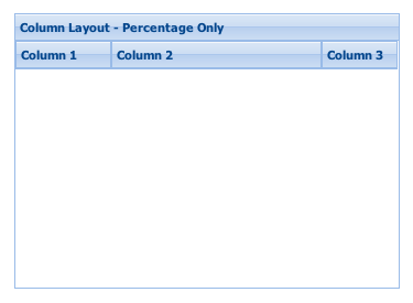
// All columns are percentages -- they must add up to 1
Ext.create('Ext.panel.Panel', {
title: 'Column Layout - Percentage Only',
width: 350,
height: 250,
layout:'column',
items: [{
title: 'Column 1',
columnWidth: .25
},{
title: 'Column 2',
columnWidth: .55
},{
title: 'Column 3',
columnWidth: .20
}],
renderTo: Ext.getBody()
});
// 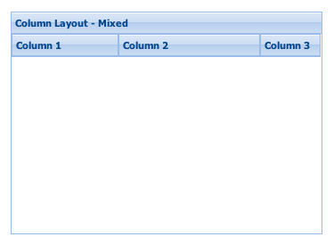 // Mix of width and columnWidth -- all columnWidth values must add up
// to 1. The first column will take up exactly 120px, and the last two
// columns will fill the remaining container width.
Ext.create('Ext.Panel', {
title: 'Column Layout - Mixed',
width: 350,
height: 250,
layout:'column',
items: [{
title: 'Column 1',
width: 120
},{
title: 'Column 2',
columnWidth: .7
},{
title: 'Column 3',
columnWidth: .3
}],
renderTo: Ext.getBody()
});
// Mix of width and columnWidth -- all columnWidth values must add up
// to 1. The first column will take up exactly 120px, and the last two
// columns will fill the remaining container width.
Ext.create('Ext.Panel', {
title: 'Column Layout - Mixed',
width: 350,
height: 250,
layout:'column',
items: [{
title: 'Column 1',
width: 120
},{
title: 'Column 2',
columnWidth: .7
},{
title: 'Column 3',
columnWidth: .3
}],
renderTo: Ext.getBody()
});
Config Options
CSS Class configs
An optional extra CSS class that will be added to the container. This can be useful for adding customized styles to the container or any of its children using standard CSS rules. See Ext.Component.ctCls also.
Other Configs
Flag to notify the ownerCt Component on afterLayout of a change
Flag to notify the ownerCt Component on afterLayout of a change
Flag to notify the ownerCt Container on afterLayout of a change
Flag to notify the ownerCt Container on afterLayout of a change
An optional extra CSS class that will be added to the container. This can be useful for adding customized styles to the container or any of its children using standard CSS rules. See Ext.Component.ctCls also.
Methods
Returns an array of child components either for a render phase (Performed in the beforeLayout method of the layout's base class), or the layout phase (onLayout).
Returns
- Array
of child components
Returns the element into which rendering must take place. Defaults to the owner Container's Ext.AbstractComponent.targetEl.
May be overridden in layout managers which implement an inner element.
Returns
- Ext.core.Element