Drawing and Charting
This document is intended to guide you through the overall design and implementation details of the Drawing and Charting packages. The drawing and charting packages enable you to create cross browser and cross device graphics in a versatile way.
The structure of this document will cover three main topics:
- Section I: "Draw" a versatile cross-browser/device package to draw general purpose graphics and animations.
- Section II: "Chart" A high level presentation of the charting package and how classes are organized in it.
- Section III: "Series" A presentation of the available series and their use.
I. The Draw Package
The design choices in the graphics team concerning drawing were not just contrained to charting: we needed a versatile tool that would enable us to create custom graphics in a cross-browser/device manner and also perform rich animations with them.
The Draw package contains a Surface class that abstracts the underlying graphics implementation and enables the developer to create arbitrarily shaped Sprites or SpriteGroups that respond to interactions like mouse events and also provide rich animations on all attributes like shape, color, size, etc.
The underlying/concrete implementations for the Surface class are SVG (for SVG capable browsers) and VML (for the Internet Explorer family - < 9). Surface can be considered as an interface for the SVG and VML rendering engines. Surface is agnostic to its underlying implementations. Most of the methods and ways to create sprites are heavily inspired by the SVG standard.
Creating a Drawing Surface
You can create a simple drawing surface without loading the Charting package at all. This can be useful to create arbitrary graphics that work on all browsers/devices and animate well. For example, you could create an interactive map of the United States where each state is a sprite, or also an infographic where each element is also a sprite. What's interesting about making sprites and not images is that the document acquires a new level of interactivity but also that being VML and SVG based the images will never loose quality and can be printed correctly.
In order to use the Draw package directly you can create a Draw Component and (for example) append it to an Ext.Window:
var drawComponent = Ext.create('Ext.draw.Component', {
    viewBox: false,
    items: [{
        type: 'circle',
        fill: '#ffc',
        radius: 100,
        x: 100,
        y: 100
    }]
});

Ext.create('Ext.Window', {
    width: 230,
    height: 230,
    layout: 'fit',
    items: [drawComponent]
}).show();
In this case we created a draw component and added a sprite to it. The type of the sprite is circle so if you run this code
you'll see a yellow-ish circle in a Window. When setting viewBox to false we are responsible for setting the object's position and
dimensions accordingly.
Sprites can have different types. Some of them are:
- circle - To draw circles. You can set the radius by using the radius parameter in the sprite configuration.
- rect - To render rectangles. You can set the width and height of the rectangle by using the width and height parameters in the sprite configuration.
- text - To render text as a sprite. You can set the font/font-size by using the font parameter.
- path - The most powerful sprite type. With it you can create arbitrary shapes by using the SVG path syntax. You can find a quick tutorial on to how to get started with the path syntax here.
A Sprite is an object rendered in a Drawing surface. There are different options and types of sprites. The configuration of a Sprite is an object with the following properties:
- type - (String) The type of the sprite. Possible options are 'circle', 'path', 'rect', 'text', 'square'.
- width - (Number) Used in rectangle sprites, the width of the rectangle.
- height - (Number) Used in rectangle sprites, the height of the rectangle.
- size - (Number) Used in square sprites, the dimension of the square.
- radius - (Number) Used in circle sprites, the radius of the circle.
- x - (Number) The position along the x-axis.
- y - (Number) The position along the y-axis.
- path - (Array) Used in path sprites, the path of the sprite written in SVG-like path syntax.
- opacity - (Number) The opacity of the sprite.
- fill - (String) The fill color.
- stroke - (String) The stroke color.
- stroke-width - (Number) The width of the stroke.
-
font - (String) Used with text type sprites. The full font description. Uses the same syntax as the CSS
fontparameter. - text - (String) Used with text type sprites. The text itself.
Additionally there are three transform objects that can be set with setAttributes which are translate, rotate and
scale.
For translate, the configuration object contains x and y attributes for the translation. For example:
 sprite.setAttributes({
   translate: {
    x: 10,
    y: 10
   }
 }, true);
For rotate, the configuration object contains x and y attributes for the center of the rotation (which are optional), and a degrees attribute that specifies the rotation in degrees. For example:
 sprite.setAttributes({
   rotate: {
    degrees: 90
   }
 }, true);
For scale, the configuration object contains x and y attributes for the x-axis and y-axis scaling. For example:
 sprite.setAttributes({
   scale: {
    x: 10,
    y: 3
   }
 }, true);
Interacting with a Sprite
Now that we've created a draw surface with a sprite in it, let's dive into how to interact with the sprite. We can get a handle to the sprite we want to modify by adding that sprite imperatively to the surface:
// Create a draw component
var drawComponent = Ext.create('Ext.draw.Component', {
    viewBox: false
});

// Create a window to place the draw component in
Ext.create('Ext.Window', {
    width: 220,
    height: 230,
    layout: 'fit',
    items: [drawComponent]
}).show();

// Add a circle sprite
var myCircle = drawComponent.surface.add({
    type: 'circle',
    x: 100,
    y: 100,
    radius: 100,
    fill: '#cc5'
});

// Now do stuff with the sprite, like changing its properties:
myCircle.setAttributes({
    fill: '#ccc'
}, true);

// or animate an attribute on the sprite
myCircle.animate({
    to: {
        fill: '#555'
    },
    duration: 2000
});

// Add a mouseup listener to the sprite
myCircle.addListener('mouseup', function() {
    alert('mouse upped!');
});
In this example we've seen how we can add events, set sprite attributes and animate these attributes using the draw package. As you can see this package is a versatile abstraction layer over the graphics we can do. What's most interesting about this class is that we aren't tied to a specific shape or structure; also all elements support events, setting attributes and creating animations. Most important of all, all of this is compatible in all browsers and devices.
II. Charts
So now that we learnt about the expressive power of the draw package, let's dive into charts. The chart package consists of a hierarchy of classes that define a chart container (something like a surface but more specific for handling charts); axes, legends, series, labels, callouts, tips, cartesian and radial coordinates, and specific series like Pie, Area, Bar, etc.
In this section we will cover how these classes are tied together and what bits of functionality go into each of these classes. We won't cover each particular series, since that is done in the next section.
Chart
The Chart class is the main drawing surface for series. It manages the rendering of each series and also how axes are drawn and defined. Chart also delegates mouse events over to different areas of the Chart like Series, Axes, etc. The Chart class extends Draw Component.
A Chart instance has access to:
- axes - Accessed through
chart.axes. All the axes being defined and drawn for this visualization. This is a mixed collection. - series - Accessed through
chart.series. All the series being drawn for the chart. This could be line, bar, scatter, etc. This is also a mixed collection. - legend - The legend box object and its legend items.
The chart instance supports custom events that can be triggered right before and during the rendering of the visualization. We can add handlers for these events by using:
chart.on({
  'refresh': function() {
    alert('(re)drawing the chart');
  }
});
Chart also delegates events like itemmousedown and itemmouseup to the series so that we can append
listeners to those objects and get the target sprite of the event.
Legend
The chart configuration object accepts a legend parameter to enable legend items for each series and
to set the position of the legend. These options are passed into the constructor of the chart. For example:
var chart = Ext.create('Ext.chart.Chart', {
    width: 200,
    height: 200,

    // Set a legend
    legend: {
        position: 'left'
    },

    // Define axes
    axes: [/*set an axis configuration*/],

    // Define series
    series: [/*set series configuration*/]
});
Each series object needs to have the showInLegend parameter set to true in order to be in the legend list.
Axis
The axis package contains an Abstract axis class that is extended by Axis and Radial axes. Axis represents
a Cartesian axis and Radial uses polar coordinates to represent the information for polar based visualizations like
Pie and Radar series. Axes are bound to the type of data we're trying to represent. There are axes for categorical
information (called Category axis) and also axis for quantitative information like Numeric. For time-based information
we have the Time axis that enables us to render information over a specific period of time, and to update that period of time
with smooth animations. If you'd like to know more about each axis please go to the axis package documentation. Also, you will find
configuration examples for axis in the bottom series examples.
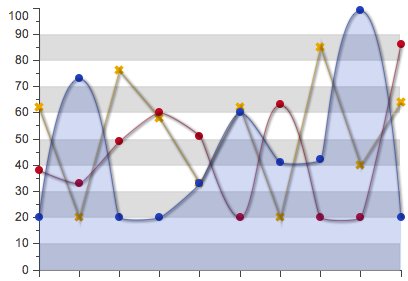
An axis contains divisions and subdivisions of values, represented by major and minor ticks. These can be adjusted automatically
or manually to some specified interval, maximum and minimum values. The configuration options maximum, minimum, majorTickSteps and
minorTickSteps in the Numeric axis are used to change the configuration and placement of the major and minor ticks. For example, by
using:
        axes: [{
            type: 'Numeric',
            position: 'left',
            fields: ['data1'],
            title: 'Number of Hits',
            minimum: 0,
            //one minor tick between two major ticks
            minorTickSteps: 1
        }, {
            type: 'Category',
            position: 'bottom',
            fields: ['name'],
            title: 'Month of the Year'
        }]
The following configuration will produce minor ticks in the left axis for the line series:
Gradients
The drawing and charting package has also the power to create linear gradients. The gradients can be defined in the Chart configuration object as an array of gradient configurations. For each gradient configuration the following parameters are specified:
- id - string - The unique name of the gradient.
- angle - number, optional - The angle of the gradient in degrees.
- stops - object - An object with numbers as keys (from 0 to 100) and style objects as values.
Each key in the stops object represents the percentage of the fill on the specified color for the gradient.
For example:
    gradients: [{
        id: 'gradientId',
        angle: 45,
        stops: {
            0: {
                color: '#555'
            },
            100: {
                color: '#ddd'
            }
        }
    },  {
        id: 'gradientId2',
        angle: 0,
        stops: {
            0: {
                color: '#590'
            },
            20: {
                color: '#599'
            },
            100: {
                color: '#ddd'
            }
        }
    }]
You can apply a gradient to a sprite by setting a reference to a gradient id in the fill property. This reference is done via a url syntax. For example:
    sprite.setAttributes({
        fill: 'url(#gradientId)'
    }, true);
Series
A Series is an abstract class extended by concrete visualizations like
Line or Scatter. The Series class contains code that is common to all of these series, like event handling, animation
handling, shadows, gradients, common offsets, etc. The Series class is enhanced with a set of mixins that provide functionality
like highlighting, callouts, tips, etc. A Series will contain an array of items where each item contains information about the
positioning of each element, its associated sprite and a storeItem. The series also share the drawSeries method that updates
all positions for the series and then renders the series.
Theming
The Chart configuration object may have a theme property with a string value that references a builtin theme name.
var chart = Ext.create('Ext.chart.Chart', {
    theme: 'Blue',
    /* Other options... */
});
A Theme defines the style of the shapes, color, font, axes and background of a chart. The theming configuration can be very rich and complex:
{
    axis: {
        fill: '#000',
        'stroke-width': 1
    },
    axisLabelTop: {
        fill: '#000',
        font: '11px Arial'
    },
    axisLabelLeft: {
        fill: '#000',
        font: '11px Arial'
    },
    axisLabelRight: {
        fill: '#000',
        font: '11px Arial'
    },
    axisLabelBottom: {
        fill: '#000',
        font: '11px Arial'
    },
    axisTitleTop: {
        fill: '#000',
        font: '11px Arial'
    },
    axisTitleLeft: {
        fill: '#000',
        font: '11px Arial'
    },
    axisTitleRight: {
        fill: '#000',
        font: '11px Arial'
    },
    axisTitleBottom: {
        fill: '#000',
        font: '11px Arial'
    },
    series: {
        'stroke-width': 1
    },
    seriesLabel: {
        font: '12px Arial',
        fill: '#333'
    },
    marker: {
        stroke: '#555',
        fill: '#000',
        radius: 3,
        size: 3
    },
    seriesThemes: [{
        fill: '#C6DBEF'
    }, {
        fill: '#9ECAE1'
    }, {
        fill: '#6BAED6'
    }, {
        fill: '#4292C6'
    }, {
        fill: '#2171B5'
    }, {
        fill: '#084594'
    }],
    markerThemes: [{
        fill: '#084594',
        type: 'circle'
    }, {
        fill: '#2171B5',
        type: 'cross'
    }, {
        fill: '#4292C6',
        type: 'plus'
    }]
}
We can also create a seed of colors that will be the base for the entire theme just by creating a simple array of colors in the configuration object like:
{
  colors: ['#aaa', '#bcd', '#eee']
}
When setting a base color the theme will generate an array of colors that match the base color:
{
  baseColor: '#bce'
}
You can create a custom theme by extending from the base theme. For example, to create a custom Fancy theme we can do:
var colors = ['#555',
              '#666',
              '#777',
              '#888',
              '#999'];

var baseColor = '#eee';

Ext.define('Ext.chart.theme.Fancy', {
    extend: 'Ext.chart.theme.Base',

    constructor: function(config) {
        this.callParent([Ext.apply({
            axis: {
                fill: baseColor,
                stroke: baseColor
            },
            axisLabelLeft: {
                fill: baseColor
            },
            axisLabelBottom: {
                fill: baseColor
            },
            axisTitleLeft: {
                fill: baseColor
            },
            axisTitleBottom: {
                fill: baseColor
            },
            colors: colors
        }, config)]);
    }
});

var chart = Ext.create('Ext.chart.Chart', {
    theme: 'Fancy',

    /* Other options here... */
});
III. Series
The following section will go through our available series/visualizations, introduce each
one of them and show a complete configuration example of the series. The example will include the Chart,
Axis and Series configuration options.
Area
Creates a Stacked Area Chart. The stacked area chart is useful when displaying multiple aggregated layers of information. As with all other series, the Area Series must be appended in the series Chart array configuration.
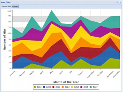
A typical configuration object for the area series could be:
var chart = Ext.create('Ext.chart.Chart', {
    renderTo: Ext.getBody(),
    width: 800,
    height: 600,
    animate: true,
    store: store,
    legend: {
        position: 'bottom'
    },

    // Add Numeric and Category axis
    axes: [{
        type: 'Numeric',
        grid: true,
        position: 'left',
        fields: ['data1', 'data2', 'data3'],
        title: 'Number of Hits',
        grid: {
            odd: {
                opacity: 1,
                fill: '#ddd',
                stroke: '#bbb',
                'stroke-width': 1
            }
        },
        minimum: 0,
        adjustMinimumByMajorUnit: 0
    }, {
        type: 'Category',
        position: 'bottom',
        fields: ['name'],
        title: 'Month of the Year',
        grid: true,
        label: {
            rotate: {
                degrees: 315
            }
        }
    }],

    // Add the Area Series
    series: [{
        type: 'area',
        highlight: true,
        axis: 'left',
        xField: 'name',
        yField: ['data1', 'data2', 'data3'],
        style: {
            opacity: 0.93
        }
    }]
});
Bar
Creates a Bar Chart. A Bar Chart is a useful visualization technique to display quantitative information for different categories that can show some progression (or regression) in the dataset. As with all other series, the Bar Series must be appended in the series Chart array configuration. See the Chart documentation for more information.
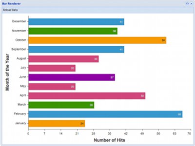
A typical configuration object for the bar series could be:
var chart = Ext.create('Ext.chart.Chart', {
    renderTo: Ext.getBody(),
    width: 800,
    height: 600,
    animate: true,
    store: store,
    theme: 'White',
    axes: [{
        type: 'Numeric',
        position: 'bottom',
        fields: ['data1'],
        title: 'Number of Hits'
    }, {
        type: 'Category',
        position: 'left',
        fields: ['name'],
        title: 'Month of the Year'
    }],
    //Add Bar series.
    series: [{
        type: 'bar',
        axis: 'bottom',
        xField: 'name',
        yField: 'data1',
        highlight: true,
        label: {
            display: 'insideEnd',
            field: 'data1',
            renderer: Ext.util.Format.numberRenderer('0'),
            orientation: 'horizontal',
            color: '#333',
           'text-anchor': 'middle'
        }
    }]
});
Line
Creates a Line Chart. A Line Chart is a useful visualization technique to display quantitative information for different categories or other real values (as opposed to the bar chart), that can show some progression (or regression) in the dataset. As with all other series, the Line Series must be appended in the series Chart array configuration. See the Chart documentation for more information.
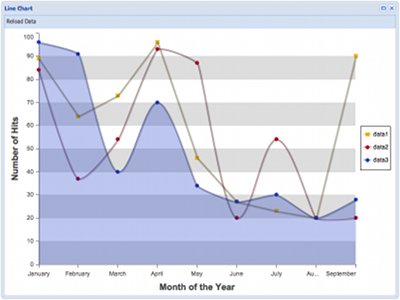
A typical configuration object for the line series could be:
var chart = Ext.create('Ext.chart.Chart', {
    renderTo: Ext.getBody(),
    width: 800,
    height: 600,
    animate: true,
    store: store,
    shadow: true,
    theme: 'Category1',
    axes: [{
        type: 'Numeric',
        minimum: 0,
        position: 'left',
        fields: ['data1', 'data2', 'data3'],
        title: 'Number of Hits'
    }, {
        type: 'Category',
        position: 'bottom',
        fields: ['name'],
        title: 'Month of the Year'
    }],

    // Add two line series
    series: [{
        type: 'line',
        axis: 'left',
        xField: 'name',
        yField: 'data1',
        markerConfig: {
            type: 'cross',
            size: 4,
            radius: 4,
            'stroke-width': 0
        }
    }, {
        type: 'line',
        axis: 'left',
        fill: true,
        xField: 'name',
        yField: 'data3',
        markerConfig: {
            type: 'circle',
            size: 4,
            radius: 4,
            'stroke-width': 0
        }
    }]
});
A marker configuration object contains the same properties used to create a Sprite. You can find the properties used to create a Sprite in the Sprite section above.
Pie
Creates a Pie Chart. A Pie Chart is a useful visualization technique to display quantitative information for different categories that also have a meaning as a whole. As with all other series, the Pie Series must be appended in the series Chart array configuration. See the Chart documentation for more information. A typical configuration object for the pie series could be:
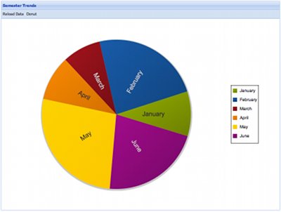
A typical configuration object for the pie series could be:
var chart = Ext.create('Ext.chart.Chart', {
    width: 800,
    height: 600,
    animate: true,
    shadow: true,
    store: store,
    renderTo: Ext.getBody(),
    legend: {
        position: 'right'
    },
    insetPadding: 25,
    theme: 'Base:gradients',
    series: [{
        type: 'pie',
        field: 'data1',
        showInLegend: true,
        highlight: {
          segment: {
            margin: 20
          }
        },
        label: {
            field: 'name',
            display: 'rotate',
            contrast: true,
            font: '18px Arial'
        }
    }]
});
Radar
Creates a Radar Chart. A Radar Chart is a useful visualization technique for comparing different quantitative values for a constrained number of categories. As with all other series, the Radar series must be appended in the series Chart array configuration. See the Chart documentation for more information.
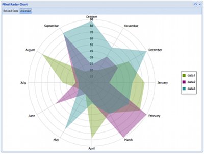
A typical configuration object for the radar series could be:
var chart = Ext.create('Ext.chart.Chart', {
    width: 800,
    height: 600,
    animate: true,
    store: store,
    renderTo: Ext.getBody(),
    insetPadding: 20,
    theme: 'Category2',
    axes: [{
        type: 'Radial',
        position: 'radial',
        label: {
            display: true
        }
    }],

    // Add two series for radar.
    series: [{
        type: 'radar',
        xField: 'name',
        yField: 'data1',
        showMarkers: true,
        markerConfig: {
            radius: 5,
            size: 5
        },
        style: {
            'stroke-width': 2,
            fill: 'none'
        }
    },{
        type: 'radar',
        xField: 'name',
        yField: 'data3',
        showMarkers: true,
        markerConfig: {
            radius: 5,
            size: 5
        },
        style: {
            'stroke-width': 2,
            fill: 'none'
        }
    }]
});
Scatter
Creates a Scatter Chart. The scatter plot is useful when trying to display more than two variables in the same visualization. These variables can be mapped into x, y coordinates and also to an element's radius/size, color, etc. As with all other series, the Scatter Series must be appended in the series Chart array configuration. See the Chart documentation for more information on creating charts.
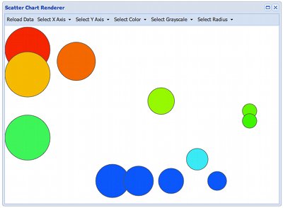
A typical configuration object for the scatter series could be:
var chart = Ext.create('Ext.chart.Chart', {
width: 800,
height: 600,
animate: true,
store: store,
renderTo: Ext.getBody(),
axes: [{
type: 'Numeric',
position: 'left',
fields: ['data1', 'data2', 'data3'],
title: 'Number of Hits'
}],
series: [{
type: 'scatter',
markerConfig: {
radius: 5,
size: 5
},
axis: 'left',
xField: 'name',
yField: 'data1',
color: '#a00'
}, {
type: 'scatter',
markerConfig: {
radius: 5,
size: 5
},
axis: 'left',
xField: 'name',
yField: 'data2'
}, {
type: 'scatter',
markerConfig: {
radius: 5,
size: 5
},
axis: 'left',
xField: 'name',
yField: 'data3'
}]
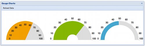
});Gauge
Creates a Gauge Chart. Gauge Charts are used to show progress in a certain variable. There are two ways of using the Gauge chart.
One is setting a store element into the Gauge and selecting the field to be used from that store. Another one is instanciating the
visualization and using the setValue method to adjust the value you want.
A chart/series configuration for the Gauge visualization could look like this:
        {
            xtype: 'chart',
            store: store,
            axes: [{
                type: 'gauge',
                position: 'gauge',
                minimum: 0,
                maximum: 100,
                steps: 10,
                margin: -10
            }],
            series: [{
                type: 'gauge',
                field: 'data1',
                donut: false,
                colorSet: ['#F49D10', '#ddd']
            }]
        }
In this configuration we create a special Gauge axis to be used with the gauge visualization (describing half-circle markers), and also we're setting a maximum, minimum and steps configuration options into the axis. The Gauge series configuration contains the store field to be bound to the visual display and the color set to be used with the visualization.