Hierarchy
This is a layout that manages multiple Panels in an expandable accordion style such that only one Panel can be expanded at any given time. Each Panel has built-in support for expanding and collapsing.
Note: Only Ext.Panels and all subclasses of Ext.panel.Panel may be used in an accordion layout Container.
Example usage:
Ext.create('Ext.panel.Panel', {
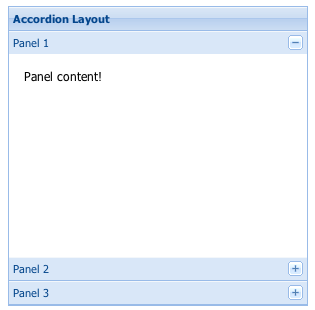
title: 'Accordion Layout',
width: 300,
height: 300,
layout:'accordion',
defaults: {
// applied to each contained panel
bodyStyle: 'padding:15px'
},
layoutConfig: {
// layout-specific configs go here
titleCollapse: false,
animate: true,
activeOnTop: true
},
items: [{
title: 'Panel 1',
html: 'Panel content!'
},{
title: 'Panel 2',
html: 'Panel content!'
},{
title: 'Panel 3',
html: 'Panel content!'
}],
renderTo: Ext.getBody()
});
Config Options
CSS Class configs
An optional extra CSS class that will be added to the container. This can be useful for adding customized styles to the container or any of its children using standard CSS rules. See Ext.Component.ctCls also.
Other Configs
Not implemented in PR4.
Only valid when {@link #multi" is false.
True to swap the position of each panel as it is expanded so that it becomes the first item in the container, false to keep the panels in the rendered order. This is NOT compatible with "animate:true" (defaults to false).
Controls how the child items of the container are aligned. Acceptable configuration values for this property are:
- left : Defaultchild items are aligned horizontally at the left side of the container
- center : child items are aligned horizontally at the mid-width of the container
- stretch : child items are stretched horizontally to fill the width of the container
- stretchmax : child items are stretched horizontally to the size of the largest item.
True to slide the contained panels open and closed during expand/collapse using animation, false to open and
close directly with no animation (defaults to true). Note: The layout performs animated collapsing
and expanding, not the child Panels.
This config is ignored in ExtJS 4.x.
Child Panels have their width actively managed to fit within the accordion's width.
Flag to notify the ownerCt Component on afterLayout of a change
Flag to notify the ownerCt Component on afterLayout of a change
Flag to notify the ownerCt Container on afterLayout of a change
Flag to notify the ownerCt Container on afterLayout of a change
True to make sure the collapse/expand toggle button always renders first (to the left of) any other tools in the contained Panels' title bars, false to render it last (defaults to false).
If the individual contained items do not have a margins property specified or margin specified via CSS, the default margins from this property will be applied to each item.
This property may be specified as an object containing margins
to apply in the format:
{
    top: (top margin),
    right: (right margin),
    bottom: (bottom margin),
    left: (left margin)
}
This property may also be specified as a string containing space-separated, numeric margin values. The order of the sides associated with each value matches the way CSS processes margin values:
- If there is only one value, it applies to all sides.
- If there are two values, the top and bottom borders are set to the first value and the right and left are set to the second.
- If there are three values, the top is set to the first value, the left and right are set to the second, and the bottom is set to the third.
- If there are four values, they apply to the top, right, bottom, and left, respectively.
Defaults to:
{top:0, right:0, bottom:0, left:0}
True to adjust the active item's height to fill the available space in the container, false to use the item's current height, or auto height if not explicitly set (defaults to true).
This configuration option is to be applied to child items of the container managed by this layout. Each child item with a flex property will be flexed horizontally according to each item's relative flex value compared to the sum of all items with a flex value specified. Any child items that have either a flex = 0 or flex = undefined will not be 'flexed' (the initial size will not be changed).
True to hide the contained Panels' collapse/expand toggle buttons, false to display them (defaults to false).
When set to true, titleCollapse is automatically set to true.
An optional extra CSS class that will be added to the container. This can be useful for adding customized styles to the container or any of its children using standard CSS rules. See Ext.Component.ctCls also.
Defaults to false. Set to true to enable multiple accordion items to be open at once.
Defaults to false. Set to true to enable multiple accordion items to be open at once.
Controls how the child items of the container are packed together. Acceptable configuration values for this property are:
- start : Defaultchild items are packed together at left side of container
- center : child items are packed together at mid-width of container
- end : child items are packed together at right side of container
Sets the padding to be applied to all child items managed by this layout.
This property must be specified as a string containing space-separated, numeric padding values. The order of the sides associated with each value matches the way CSS processes padding values:
- If there is only one value, it applies to all sides.
- If there are two values, the top and bottom borders are set to the first value and the right and left are set to the second.
- If there are three values, the top is set to the first value, the left and right are set to the second, and the bottom is set to the third.
- If there are four values, they apply to the top, right, bottom, and left, respectively.
Defaults to: "0"
Not implemented in PR2.
True to allow expand/collapse of each contained panel by clicking anywhere on the title bar, false to allow expand/collapse only when the toggle tool button is clicked (defaults to true). When set to false, hideCollapseTool should be false also.
Methods
Returns an array of child components either for a render phase (Performed in the beforeLayout method of the layout's base class), or the layout phase (onLayout).
Returns
- Array
of child components
Returns the element into which rendering must take place. Defaults to the owner Container's Ext.AbstractComponent.targetEl.
May be overridden in layout managers which implement an inner element.
Returns
- Ext.core.Element
Returns the owner component's resize element.
Returns the owner component's resize element.
Returns
- Ext.core.Element