Hierarchy
Ext.layout.LayoutExt.layout.container.AbstractContainerExt.layout.container.ContainerExt.layout.container.AnchorExt.layout.container.Absolute
This is a layout that inherits the anchoring of Ext.layout.container.Anchor and adds the ability for x/y positioning using the standard x and y component config options.
This class is intended to be extended or created via the layout configuration property. See Ext.container.Container.layout for additional details.
Example usage:
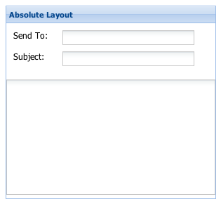
Ext.create('Ext.form.Panel', {
    title: 'Absolute Layout',
    width: 300,
    height: 275,
    layout:'absolute',
    layoutConfig: {
        // layout-specific configs go here
        //itemCls: 'x-abs-layout-item',
    },
    url:'save-form.php',
    defaultType: 'textfield',
    items: [{
        x: 10,
        y: 10,
        xtype:'label',
        text: 'Send To:'
    },{
        x: 80,
        y: 10,
        name: 'to',
        anchor:'90%'  // anchor width by percentage
    },{
        x: 10,
        y: 40,
        xtype:'label',
        text: 'Subject:'
    },{
        x: 80,
        y: 40,
        name: 'subject',
        anchor: '90%'  // anchor width by percentage
    },{
        x:0,
        y: 80,
        xtype: 'textareafield',
        name: 'msg',
        anchor: '100% 100%'  // anchor width and height
    }],
    renderTo: Ext.getBody()
});
Config Options
CSS Class configs
An optional extra CSS class that will be added to the container. This can be useful for adding customized styles to the container or any of its children using standard CSS rules. See Ext.Component.ctCls also.
Other Configs
This configuation option is to be applied to child items of a container managed by this layout (ie. configured with layout:'anchor').
This value is what tells the layout how an item should be anchored to the container. items added to an AnchorLayout accept an anchoring-specific config property of anchor which is a string containing two values: the horizontal anchor value and the vertical anchor value (for example, '100% 50%'). The following types of anchor values are supported:
- Percentage : Any value between 1 and 100, expressed as a percentage.The first anchor is the percentage width that the item should take up within the container, and the second is the percentage height. For example:
// two values specified anchor: '100% 50%' // render item complete width of the container and // 1/2 height of the container // one value specified anchor: '100%' // the width value; the height will default to auto - Offsets : Any positive or negative integer value.This is a raw adjustment where the first anchor is the offset from the right edge of the container, and the second is the offset from the bottom edge. For example:
// two values specified anchor: '-50 -100' // render item the complete width of the container // minus 50 pixels and // the complete height minus 100 pixels. // one value specified anchor: '-50' // anchor value is assumed to be the right offset value // bottom offset will default to 0 - Sides : Valid values are 'right' (or 'r') and 'bottom'
(or 'b').Either the container must have a fixed size or an anchorSize config value defined at render time in order for these to have any effect.
- Mixed : Anchor values can also be mixed as needed. For example, to render the width offset from the container right edge by 50 pixels and 75% of the container's height use:
anchor: '-50 75%'
Flag to notify the ownerCt Component on afterLayout of a change
Flag to notify the ownerCt Component on afterLayout of a change
Flag to notify the ownerCt Container on afterLayout of a change
Flag to notify the ownerCt Container on afterLayout of a change
default anchor for all child container items applied if no anchor or specific width is set on the child item. Defaults to '100%'.
An optional extra CSS class that will be added to the container. This can be useful for adding customized styles to the container or any of its children using standard CSS rules. See Ext.Component.ctCls also.
Methods
Returns an array of child components either for a render phase (Performed in the beforeLayout method of the layout's base class), or the layout phase (onLayout).
Returns
- Array
of child components
Returns the element into which rendering must take place. Defaults to the owner Container's Ext.AbstractComponent.targetEl.
May be overridden in layout managers which implement an inner element.
Returns
- Ext.core.Element